
The Visual Strategy
This is a transcript from Visium: The Secret Language of Images. Listen to the episode below:
A director and a cinematographer sit down to plan a film shoot. They go over the story, talk about the characters, and even act out the scene themselves to figure out the best shots. After careful planning, they lock in a tight shot list that they’re both happy with.
Then, the day comes. Everyone arrives on set. The location looks a little different than expected, but they still feel confident their plan is going to work.
If film images are meant to communicate a deeper, subtextual message to the audience, and tools like lens choice or camera movement make up the visual language, then visual strategy is like the grammar of that language.
Then the actors step in. They run through the first rehearsal—and suddenly, they do something entirely different from what the director envisioned and the cinematographer already assumed. And the surprising thing? It’s better.
But going with a new approach means changing the shots, the lighting and spend more time…
So what happens now? What does the director do? Could this have been prevented, or anticipated somehow?
If this—or something like it—has ever happened to you, you’re not alone. Most filmmakers run into this at some point and start wondering if there’s a better way to approach shot-listing. And today, maybe we’ll solve it once and for all.
My name is Tal Lazar, and this is “Visium”, where we explore images, and figure out what makes them work. In this first series, we focus on images in movies.
The shot list is where all the conversations between the director and cinematographer during pre-production come together. They watch movies together, figure out a visual style—it all leads to a shot-list. But there’s a catch: when a shot list is made, locations are usually still up in the air, not every actor is cast, and scenes haven’t been rehearsed.
Because of that, filmmakers end up making a lot of assumptions when they plan shots, and many of those assumptions turn out to be wrong. On low-budget films, last-minute location or schedule changes are very common, and they introduce new challenges that weren’t considered before.
That doesn’t mean shot lists aren’t important. They still serve a purpose. But they aren’t rigid plans; they have to be flexible. To work efficiently on set, filmmakers need more than just a list of shots—they need a roadmap, a set of guidelines to adjust the shot list or even come up with new shots on the spot. That’s where visual strategy comes in.
A strategy is a plan designed to reach a specific goal. With a visual strategy, the focus shifts away from individual shots and onto their purpose—the impact they’re meant to have. And that impact is always about serving the story.
The first step in creating a visual strategy is to understand the story. That could mean the film as a whole since every scene and character choice fits into a bigger picture. But it also applies to smaller moments—mini-stories within scenes and sequences.
Take The Lives of Others, for example, an excellent German film from 2006. It opens with an interrogation scene. The interrogator is the the protagonist of the movie, but the man being questioned—the one who resists at first and eventually breaks—has his own story too, even though that guy disappears from the film after that moment.
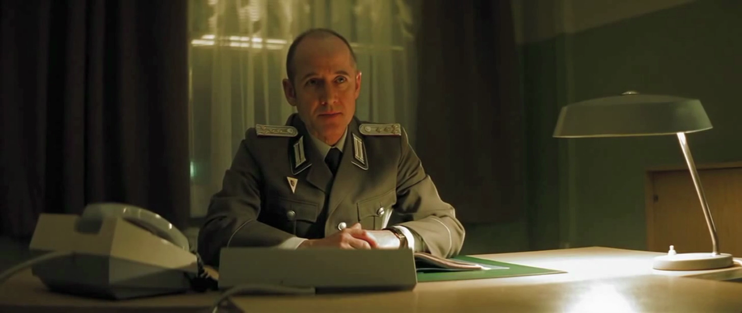
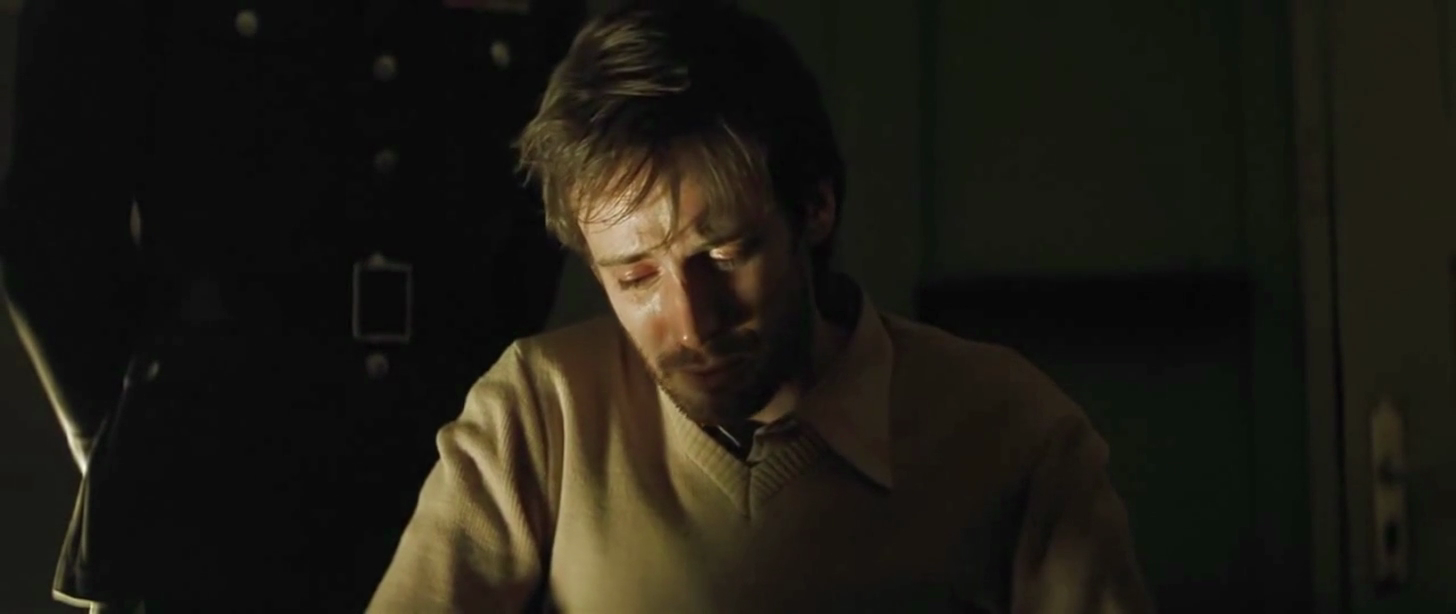
A visual strategy starts by breaking down the script, understanding every scene’s story and every character that has an emotional arc. Even smaller characters, like the guy being interrogated in The Lives of Others. From there, it’s about making strategic choices that create the foundation for shots.
Remember the story of the Scorpion and the Frog? Imagine if a director decided to tell it from the Scorpion’s perspective instead of the Frog’s. This is a strategic choice, and that choice alone would change everything about how the shots are designed. Instead of focusing on the Frog’s hesitation and decision, the camera might turn to the Scorpion trying to hide his true intentions.
Narrative perspective is one of those big strategic decisions that shape how we design shots. And it’s not the only one. A visual strategy brings together all of these choices to guide us in telling a story through sequences of images, where our visual style needs to be consistent and guide the audience over time.
If film images are meant to communicate a deeper, subtextual message to the audience, and tools like lens choice or camera movement make up the visual language, then visual strategy is like the grammar of that language. Just like grammar lays out the structure of spoken or written language, visual strategy dictates how cinematic language is structured and understood.
There are three elements that make visual strategy:
The first is association. When we see an image, we interpret it using what we already know—our own experiences in life, films we’ve seen, and other cultural references. In other words, we bring pre-existing associations into the way we understand new images.
Here’s a simple example: when a flashlight shines straight into the camera and creates a lens flare, we instinctively associate it with the sensation of being temporarily blinded, even though watching it in a movie doesn’t actually blind us. Cultural associations work the same way. The color red, for instance, can mean different things. In China, it represents happiness and luck, and in many Western cultures, it has different connotations, like danger or passion. These built-in associations can be powerful storytelling tools, but they also depend on the context. What works in one setting might not have the same effect in another.
Most films don’t rely entirely on existing associations, though—they create new ones. Think about how kids learn language. An adult points at an object, says a word, and, over time, the child connects the two. That’s an association. The same principle applies in visual storytelling, where filmmakers can link a visual element, like color, to an idea, story, or character.
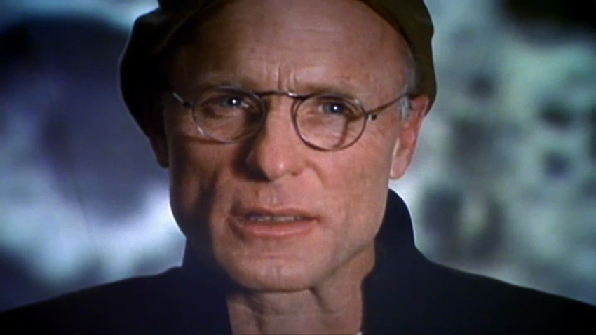
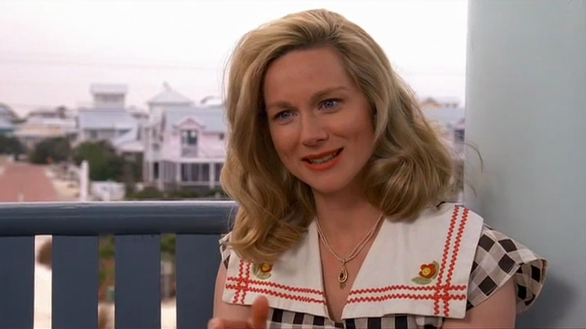
A great example is The Truman Show. Truman lives inside a reality show, where hidden cameras cover every second of his life. There’s a filmmaking challenge the creators of The Truman Show had to face: sometimes the audience sees Truman through these in-world surveillance cameras, and other times they see him, and other characters, through regular shots like in any other movie. The filmmakers had to establish a visual difference between the two types of perspectives in the movie so the audience wouldn’t get confused.
They solved this by opening the movie with interviews featuring the reality show’s cast, who speak directly to the camera, breaking the fourth wall. Right away, we understand there’s a TV show within the film and that the camera has two roles. Once the story officially begins, the audience is already familiar with the visual language, and the movie can use it to tell the story.
So the first element of visual strategy is association, which comes from either using pre-existing associations or teaching the audience new ones. The second element is emphasis.
Storytelling revolves around transformation—characters change, situations shift, key moments happen. In movies, these moments are usually emphasized visually.
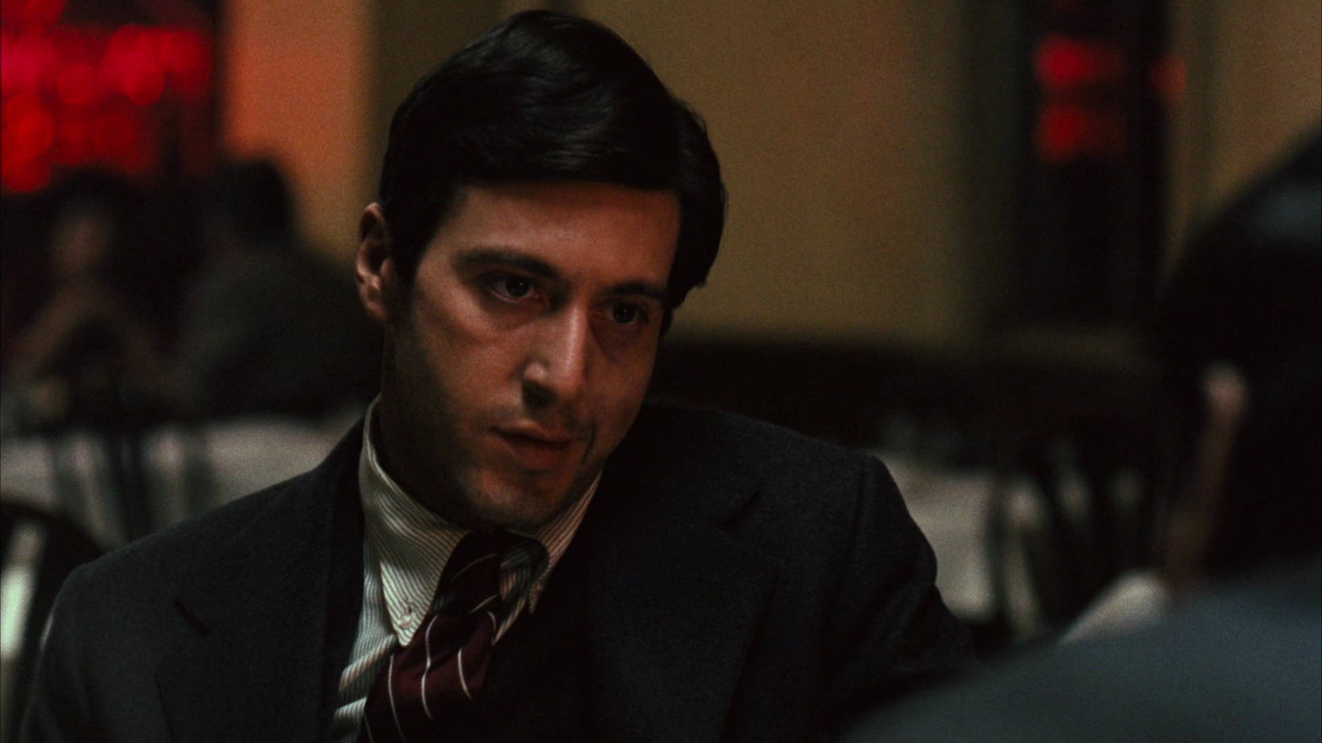
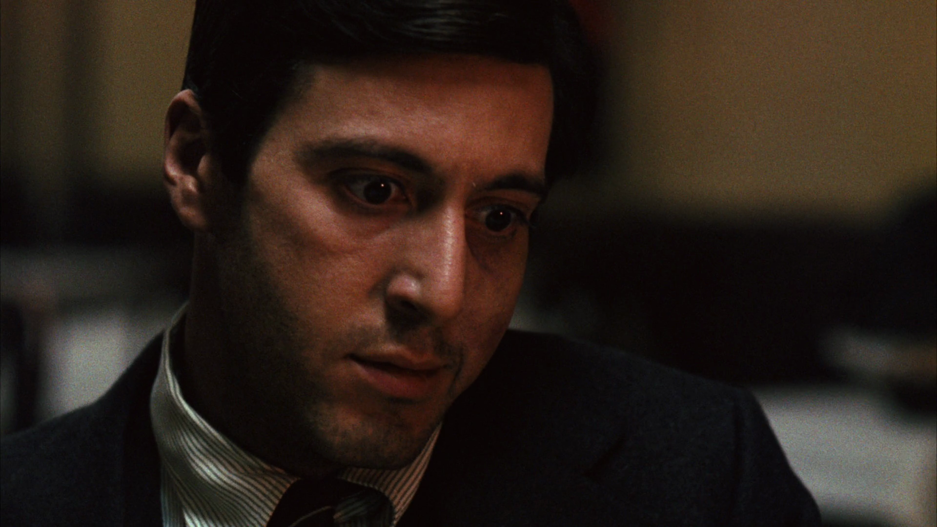
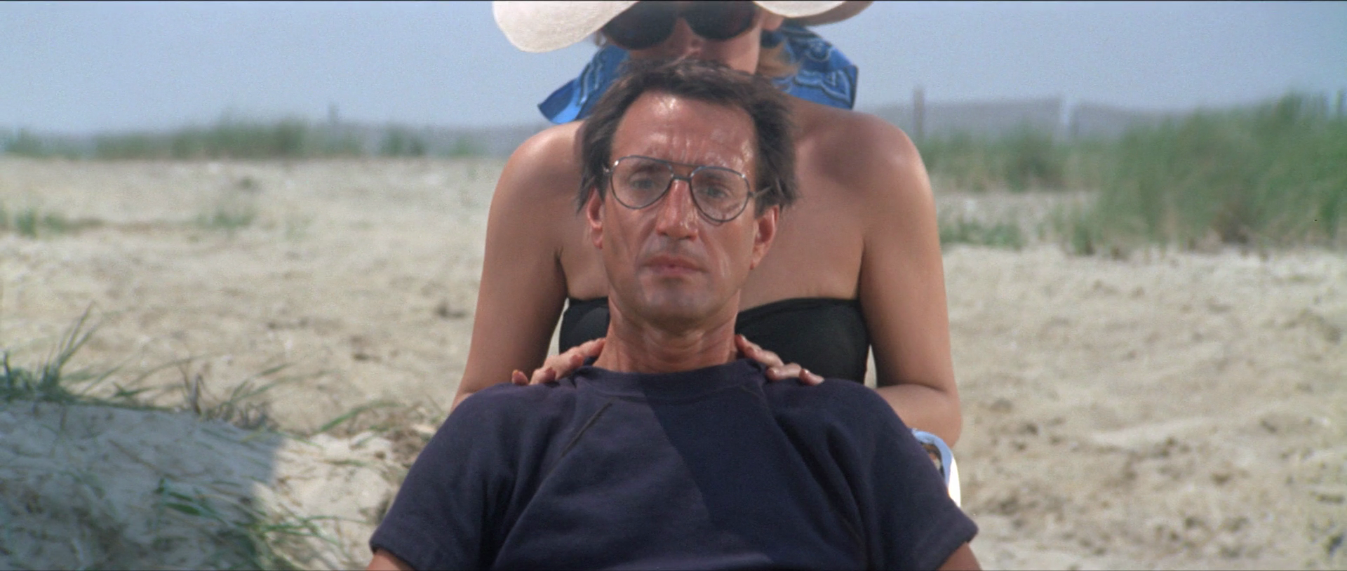
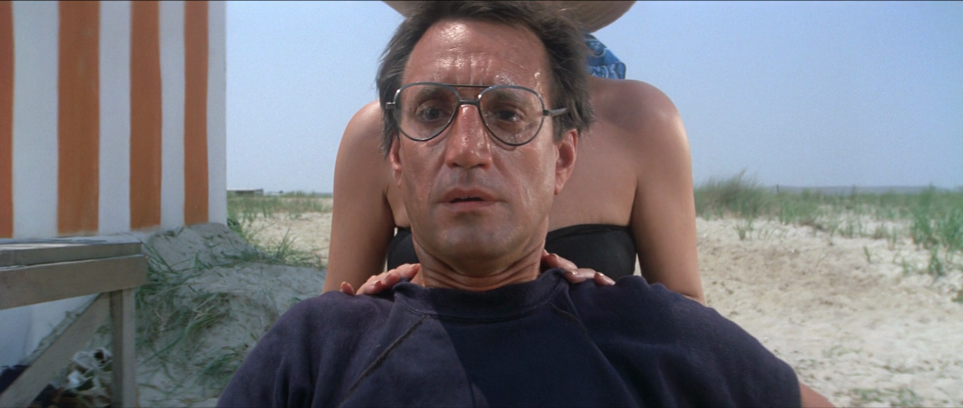
Think about one of the most famous scenes from The Godfather. Michael Corleone is at a restaurant with two other mafia bosses. He is getting ready to kill them, but it’s not until the last moment that he actually brings himself to do it. At that moment, the camera pushes in on his face. Up until that point, the shots in the scene have been stationary, making this push-in stand out. Or take the film Jaws. When Chief Brody sees the shark attack, the camera pushes in to his face, while zooming out at the same time, creating the famous vertigo effect.
What these moments have in common is a sudden change in visual style that draws the attention of the audience. It’s like speech—how we say something can change its meaning. Compare these two sentences:
"I left my house, and then I saw my neighbor getting out of his car."
"I left my house, and then I saw my neighbor getting out of his car."
Same words, different meaning. The shift in tone changes how we interpret the sentence. Visual storytelling works the same way. To create emphasis, there has to be contrast. In The Godfather, the break in the static shots makes the push-in feel significant. In another scene a moment could be emphasized by cutting to a close-up after only wide shots, or a light turning on in an otherwise dark scene.
With emphasis in mind, our approach to shot-listing changes entirely. Instead of starting from the beginning of a scene and listing shots in order, a strategic approach would begin by identifying the most important moment—where emphasis is needed. That decision then helps shape how the beginning of the scene is filmed too.
So far, we’ve covered two key elements of visual strategy: association and emphasis. The third and final element is context.
Movies are never watched in isolation. You might see a film in a theater, at home, on a TV, or even on a smartphone. Each setting has an effect on how you experience the movie. If the movie is boring, for example, it might take you a few more minutes to leave if you’re in a theater than if you’re watching it online on your phone.
Filmmakers have to consider where and how their movie will be seen. A close-up that works on YouTube might not work the same way on an IMAX screen. Genre matters too—horror movies follow certain expectations that shape visual choices, no matter what the story is.
Filmmakers can either embrace those expectations or break them to create contrast or misdirection. One example for this type of misdirection is Stanley Kubrick’s Dr. Strangelove. Its cinematography looks like a serious drama—intense dramatic lighting lighting, dark scenes—all paired with absurd characters and dialogue, and it becomes satire. Then there’s Saturday Night Fever. When the movie came out, viewers knew about the Bee Gees soundtrack and John Travolta, then a sitcom actor and dancer, so they expected a lighthearted disco movie. The cinematography of the movie leaned into that expectation, but the film was actually a coming-of-age drama with heavier anti-war themes.
Context shapes what audiences expect before they even watch a movie. Along with association and emphasis, it’s one of the three key elements of visual strategy. Instead of jumping straight into a shot list, start with a strategy that guides those choices. This approach creates a strong visual language where every shot serves a purpose. When that purpose is clear, finding the right shot becomes as straightforward as rewording a sentence when explaining an idea verbally.
The best way to learn about visual strategy is to try and find it in great movies. But that can be tricky because we usually don’t have access to the conversations between directors and cinematographers. Still, the clues are there on screen, and by paying attention, we can start to uncover the strategy behind their choices.
One way to do this is by looking for emphasis. When something stands out visually—a shift in lighting, movement, or framing—it’s worth asking why. The answer usually connects to the story.
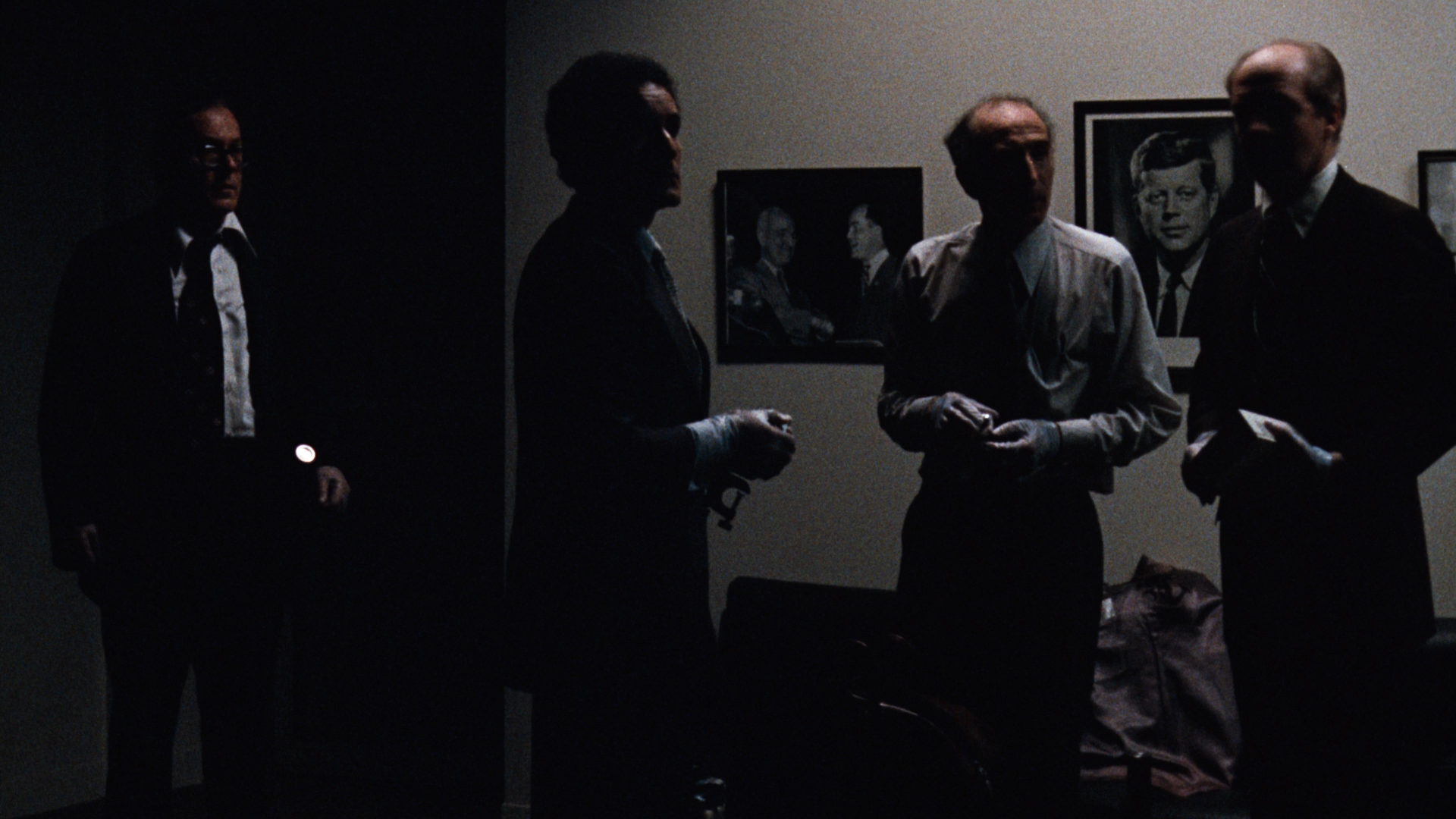
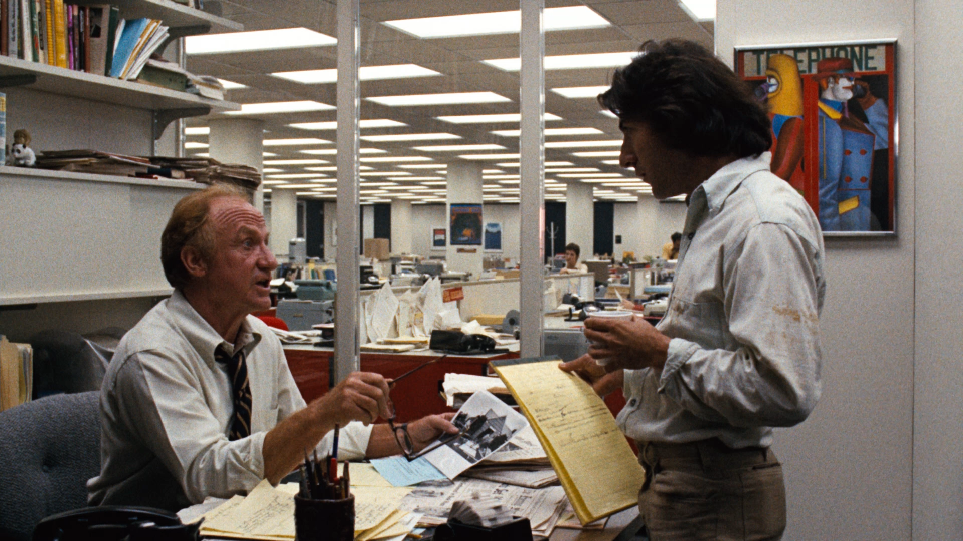
A good example is the film All the President’s Men. The movie opens with a very dark scene and then cuts to a bright newsroom. This contrast continues throughout the movie as a visual pattern: darkness is quickly associated with crime and secrecy, and brightness is tied to the journalists uncovering the truth. With repetition, the audience quickly understands this visual language.
Another approach to uncover visual strategy is to compare the beginning and end of a scene. Side by side, you might notice a transformation in the images. More importantly, compare a character at the start of a scene to that same character at the end. If the story changes them, the images should reflect that shift.
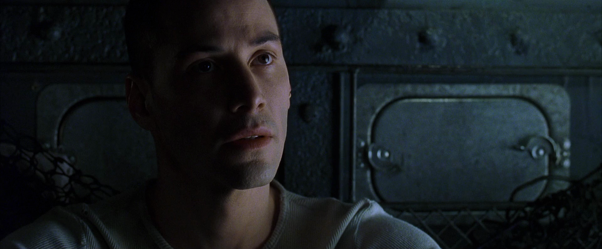
In The Matrix, Neo’s world at the start is tinted in a sickly green. When he wakes up in the real world, the environment shifts to blue. Both worlds are far from ideal. The key difference? His skin in the real world looks warm and lifelike, no longer sickly green. Color isn’t just used to distinguish between the two worlds—it also reflects Neo’s transformation. Even though the real world is harsh and far from perfect, he is truly alive for the first time.

Our next step is to look closely at some strategic decisions directors and cinematographers make before creating shots. This will take us into narrative perspective and point-of-view. If that sounds interesting, please consider subscribing, leaving a review, and joining me as we continue exploring storytelling and the many ways visual artists bring it to life through images.
If you have any thought, an example that wasn’t mentioned or a question, feel free to reach out—just email [email protected] . You can also check out my book at TheLanguageofCinematography.com.
Thanks for spending time with me today. Goodbye!