The Perfect Lens
This is a transcript from Visium: The Secret Language of Images. Listen to the episode below:
You know those big photography and video stores, like B&H in New York or Samy’s Camera in Los Angeles? Picture yourself heading up to the lens floor—yeah, they have an entire floor just for lenses. You look around and see tons of options. In our last episode, we talked about focal length, but now you're seeing something different: multiple lenses with the same focal length.
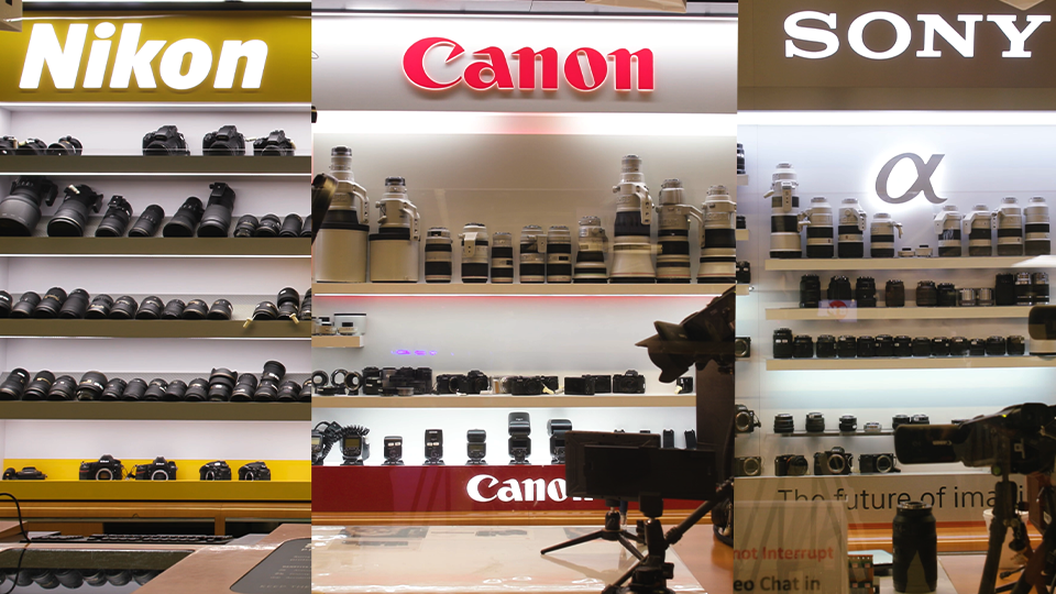
Want a 50mm lens? No problem. But do you want a Zeiss, Canon, or Sigma? Are you looking for a photography lens or a cinema lens? And if you check the price tags, you’ll see huge differences. You could grab a Canon 50mm stills lens for $100, or another one for $2,000. So what’s the real difference when they both say 50mm?
A lot of people think distortion only happens with really wide-angle lenses. But that’s not completely true. Some wide lenses are designed not to distort much at all
You’re probably thinking, “This is why I work with a professional collaborator, to help me make these decisions.” And yes, ideally, a good collaborator listens, explains the pros and cons, and helps you decide what’s worth spending on. But it’s not always easy to find someone who’s unbiased or willing to walk you through everything.
That’s what this series is about. We’re digging into the creative side of cinematography and its tools, so you can be part of the conversation—or even lead it. Today, we’ll look at some features and traits of lenses that shape the look of your image and affect how you use them on set.
I’m Tal Lazar, and this is Visium—where we look at images and figure out what makes them work. In this first series, we’re focusing on images in movies.
Before we start, I want to take a moment to answer a question from listener. It goes: “The examples and techniques you talk about in the episodes seem to come almost entirely from narrative films. What about documentaries? Can these ideas apply to docs too?”
Great question—and you're right. My background is mostly in fiction, so I naturally pull examples from those films. But I’ve also worked on documentaries, and there’s a basic idea that ties everything together: the real power of our non-technical approach doesn’t come from the director or cinematographer; it comes from the audience.
You might remember Irving Penn’s quote from episode one, where we talked about “effective images,” or images with a purpose. That purpose shows up in how the audience reacts, not in what the artist intended. If the artist gets the message across and the audience connects with it, that’s what matters. So, in theory, there’s no reason why this wouldn’t apply to documentaries just as much as fiction.
In fact, there’s research behind this idea. It's called “narrative transportation”—an academic term for what filmmakers refer to as suspension of disbelief. It’s that moment when the audience forgets they’re watching a movie and just falls into the story. And the research shows that whether the audience is told a story is real or fictional, their experience—how they respond emotionally and the connection they feel—is pretty much the same.
That means everything we’ve talked about (story, perspective, camera placement, lens choice) matters just as much in documentaries as it does in fiction.
Now, I can already hear some of you raising a good point: fiction directors get to plan ahead, rehearse, and test things out. Documentary directors dive into situations as they happen, without a script or time to think everything through in advance. So how can it be the same when docs don’t have the luxury of all that preparation?
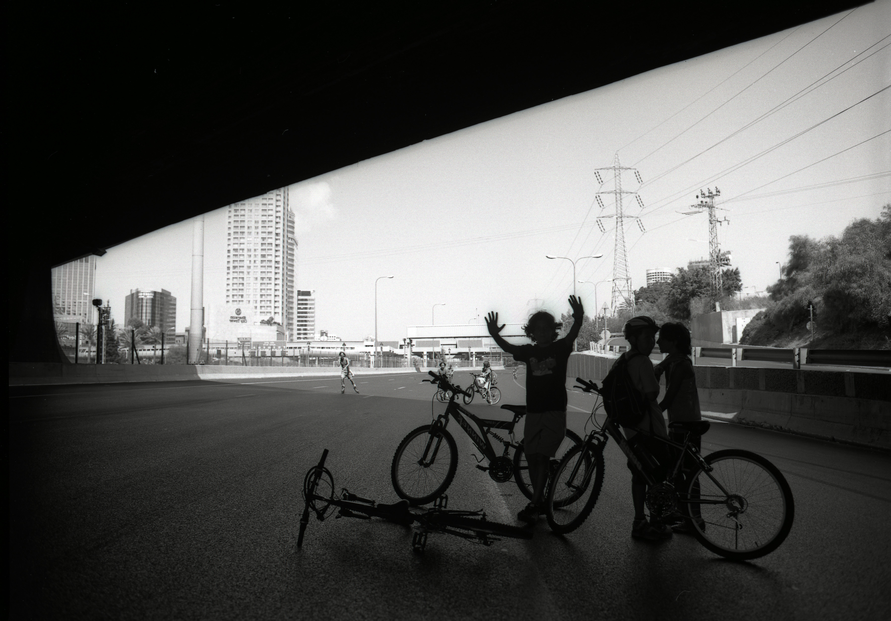
To answer that question, let’s step away from movies for a moment and look at street photography. Meet Henri Cartier-Bresson, one of the pioneers of street photography. He came up with the idea of “the decisive moment” — a single instant when everything lines up just right, and a photo captures something deeper. Like a picture of an old couple kissing: looking at it, you might think about love, aging, or even your own relationships. It becomes more than just a moment—it means something.
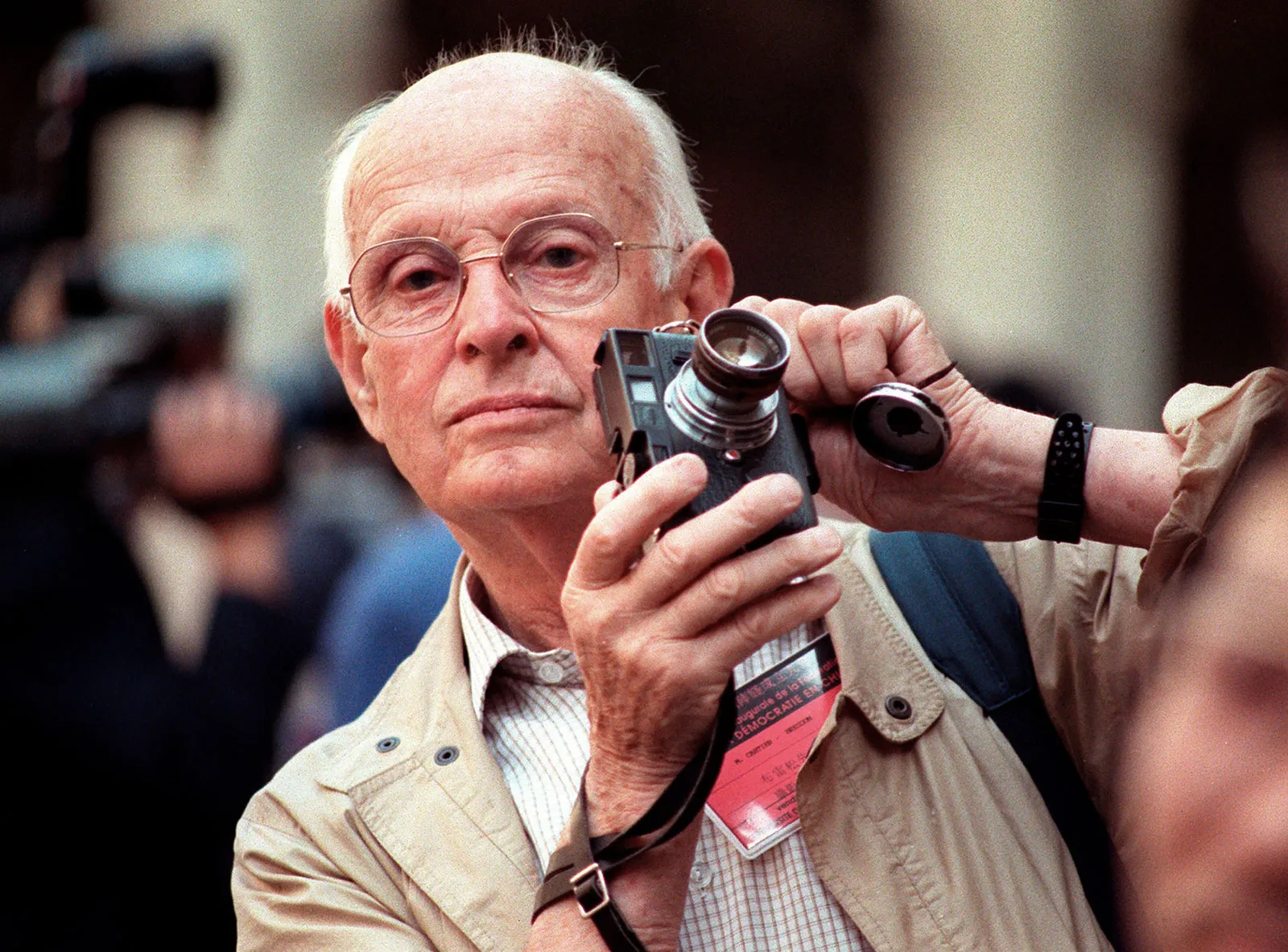
There’s a story about Bresson walking the streets of Paris, like he often did, hunting for that perfect moment. He walked past a construction site surrounded by a tall wooden fence. In the fence, there was a small hole. He stuck the lens of his 35mm camera through that hole and snapped a photo. That image—of a man mid-leap over a puddle, just before landing—became one of his most famous shots.
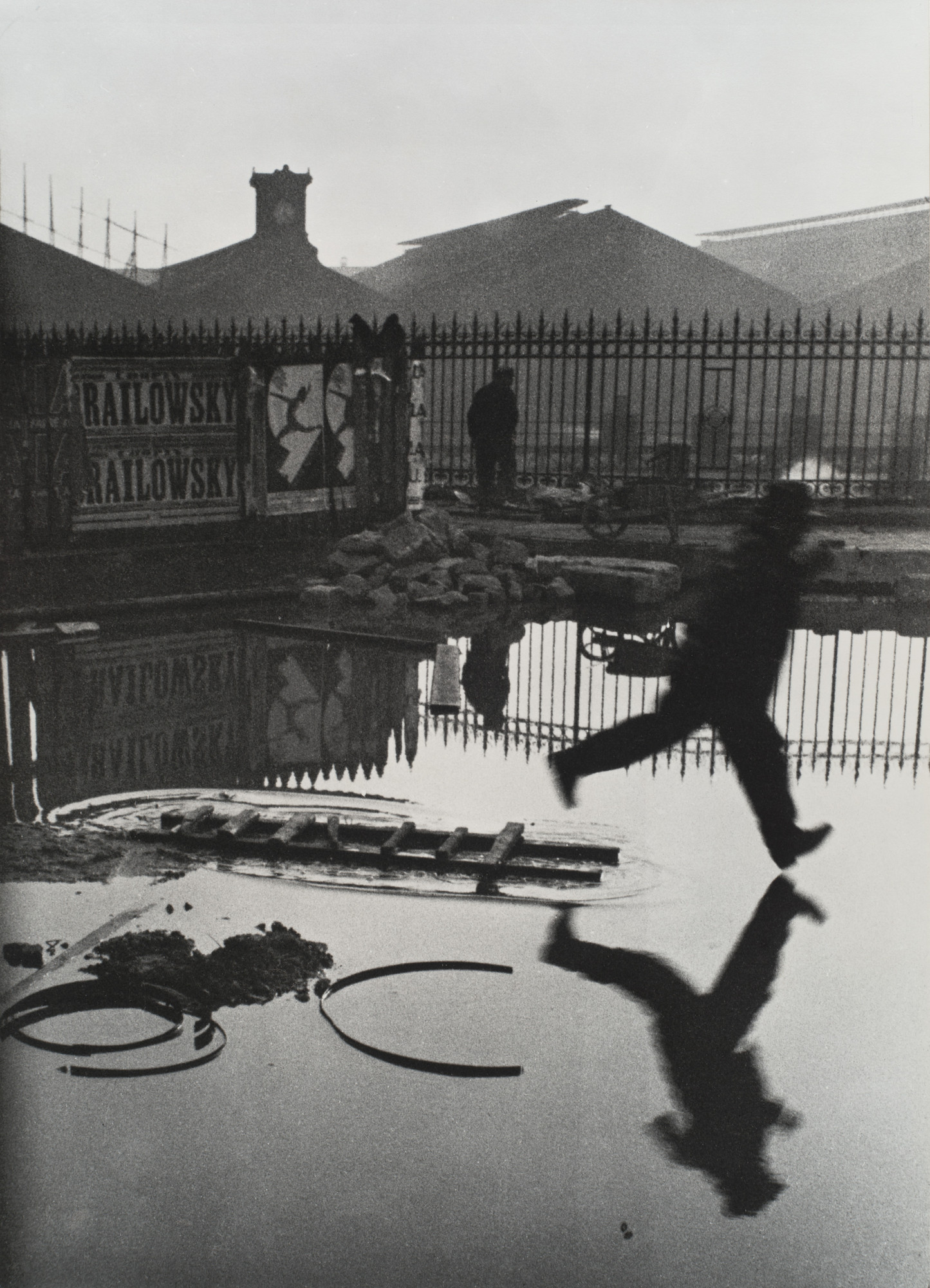
All that is nice, but if you think about it, it looks like Bresson had no control over that moment. He couldn't really see his subject. He didn’t set anything up. It was fast, spontaneous—kind of like making a documentary.
So how can we take something like that seriously, especially when it seems like it was all luck?
There are two ways to look at this. One is to focus on the audience. If the image connects with people, if it says something and makes you feel something, then it’s worth talking about. We can study that image, learn from it, and try to apply those lessons in our own work—even if the original moment wasn’t planned.
But there’s an even better answer. Because while Bresson didn’t control the moment, he did make choices. He picked a lens before going out, even though he didn’t know what he’d find. He chose a type of film—what today we’d just call ISO on a digital camera. He set a shutter speed, which affects how motion is captured. All of those settings shape the final image. None of those choices were random, and you actually can’t even take a photo without making these choices.
So even in unpredictable situations—like street photography or documentaries—there’s still a lot of creative decision-making happening. And that’s why intention and visual choices still matter, even when you don’t have all the control.
I like taking street photos too, and when I head out with my camera, I usually decide what kind of images I want to capture that day. I like to imagine Bresson doing the same. If I want to be right in the middle of the action—create that feeling of being part of the moment—I’ll grab a wide lens and be ready to get up close. But if I’m in more of an observational mood, I’ll use a longer lens and stay at a distance. When I’m out, I set the camera settings based on what I am looking for. If I want to create a sense of movement, I slow down the shutter and look for moving subjects.
Do I sometimes take a photo and wish I had picked a different lens or changed a camera setting, but there just wasn’t time? Absolutely. That’s just part of it.
And really, this all comes back to visual strategy, the choices we make before picking specific shots or even locations. Remember, strategy is what guides our creative decisions across a project. It’s not only for scripted films. Documentary filmmakers can (and should) think visually from the start too. Those who do often achieve the kind of visual consistency we usually associate with fiction films.
Take Some Kind of Heaven, a documentary that follows residents of The Villages, a massive retirement community in Florida. The film uses an observational style and an objective narrative perspective. It doesn’t push you to side with one character, but invites you to think about the community and the people in it from a distance. That decision shapes pretty much all the choices of lens and camera placement in the film.

On the other hand, in Minding the Gap, the story is mostly told in the first person. The filmmaker used a wide lens and got very close, making you feel like you’re part of a tight-knit group of friends. Both films have very different tones and approaches, but they share one thing in common: a strong visual strategy from the start.
The directors didn’t know exactly how things would play out, and they couldn’t plan every moment—but they knew how they wanted the audience to feel. And that intention is what gives the visuals their quiet power.
Alright, back to lenses. Hopefully, it’s clear by now that even in documentaries, lens choice is guided by the kind of effect the director wants to create, not by trying to guess exactly what will happen in front of the camera. Sure, there are exceptions—like when you physically can’t get close to your subject and have to shoot from far away, maybe in a concert. But those are usually exceptions, not the rule.
In the last episode, we talked about one of the most important qualities of a lens: focal length. But that’s just the beginning. A lens’s overall quality is shaped by other factors too. One of those is distortion.
A lot of people think distortion only happens with really wide-angle lenses. But that’s not completely true. Some wide lenses are specially designed not to distort much at all—these are called rectilinear lenses. That design alone can make one wide lens cost hundreds or even thousands more than another. And distortion isn’t limited to wide lenses—long lenses can also distort images, just in a different way.
So, what exactly is distortion? It happens when a lens changes the shape or proportions of something in the frame, compared to how it looks in real life. That’s what makes distortion tricky to spot—because if you don’t know what something looks like in person, you have no way of knowing if it looks “off” in the photo or video.
To evaluate distortion, we usually don’t look at just one image. It’s a lot easier to notice differences when you compare photos taken with different lenses. That way, you can actually see how one lens may stretch, compress, or shift the shape of what you’re looking at. Comparing is key—it helps make the invisible, visible.
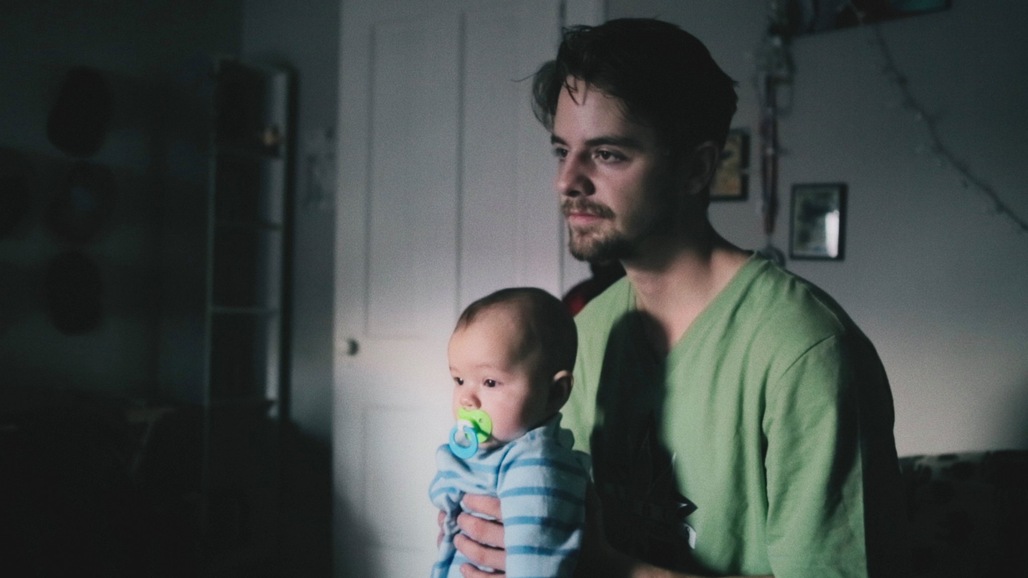
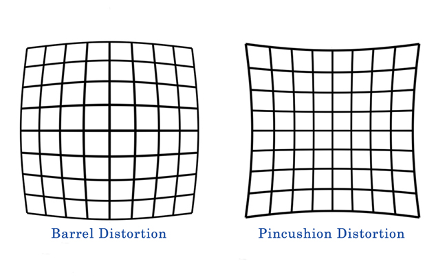
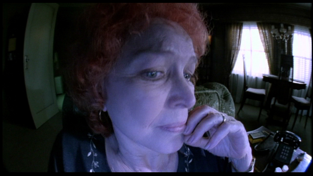
There are two types of distortion to know about. The first is barrel distortion. That’s when the center of the image appears larger than the edges. A classic example is when someone leans toward a very wide-angle lens, and their face looks oversized compared to their shoulders. The second type is pincushion distortion, which is the opposite—the center looks smaller than the edges.
The easiest way to spot distortion is by photographing straight lines, like a grid or a building’s architecture. That’s why lens technicians use test charts—to see how a lens affects the shape of something familiar. But as filmmakers, we’re not shooting charts. We're working with people. And that’s where distortion can actually become a storytelling choice.
Barrel distortion shows up most with very wide-angle lenses. But even among lenses with the same focal length, not all wide lenses distort in the same way. Some are designed to correct it better than others. Pincushion distortion, on the other hand, mostly appears in long telephoto lenses, though again, not every long lens will show it.
So while distortion might seem like a technical flaw, it can also be a creative tool—especially when we’re thinking about how to shape the viewer’s experience of a character or a scene.
Another key quality of lenses is perspective. We’ve already talked about how objects at different distances from the camera appear in terms of size and depth, depending on the camera's position and the lens being used. But here’s where it gets a little tricky—perspective and distortion often get mixed up. They’re not the same thing.
Distortion makes straight lines look curved. Perspective, on the other hand, affects how far apart objects appear from each other in the image, and how close or far they seem from the camera.
Imagine a straight row of dominoes. If you take a wide lens and get really close to the first one, it’ll look big in the frame. The next domino behind it will appear smaller, and the one after that even smaller—each one shrinking in size. But if you switch to a long lens and move the camera farther back, the difference in size between the first and second domino gets smaller. The whole row starts to look more compressed. On an even longer lens, all the dominoes might look almost the same size, and the sense of depth nearly disappears. We saw that effect back when we compared focal lengths in the previous episode.


Now, let's talk about another important lens quality: flares and glares.
You’ve definitely seen flares before—they’re those lines, rings, or bright spots that show up when light shines directly into the lens. Glares are a little different. These show up as a loss of contrast or a weird color shift in certain parts of the image, usually because of light bouncing around inside the lens or hitting it at an odd angle.
Camera crews usually try to keep these under control. They’ll clean the lens, block direct light with matte boxes and flags, and watch out for tricky light sources like windows that might be in the frame. But even with all that, some lenses just handle flaring and glaring better than others.
A big reason for that is the number of glass elements inside a lens. More glass means more chances for light to bounce around. That’s why zoom lenses, which have more glass inside, tend to flare more. But really, the biggest factor is the lens coating. These coatings are thin, clear chemical layers on the surface of the glass elements that help prevent light from scattering inside the lens. Today’s lenses have much better coatings than older ones, which is why modern lenses tend to flare less.
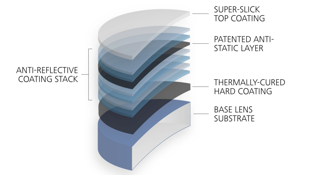
A place where you can easily spot lens coatings is on eyeglasses. If you look closely, you’ll notice that they reflect light—but often with a tint, like blue or red. That’s because the coatings on the glasses are designed to block or absorb some wavelengths of light while reflecting others. And the way those wavelengths vary is what we see as color.
We’ll dig deeper into how that works when we get to our episode on color. But for now, the key point is this: camera lenses have coatings too, and one of their main jobs is to reduce or eliminate flares. So, when you see a flashlight shining into a les without a flare, or a bright window in an image without any glare, it’s not just luck—it’s the result of coatings doing their job.
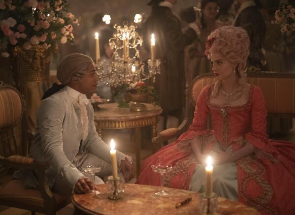
One thing worth noting is that flares and glares aren’t always bad. Sometimes, filmmakers want those effects. They might use old lenses, for example, because these have no coatings or coatings that don’t work as well as modern ones, deliberately. Other times, they’ll even ask lens technicians to remove the coating on modern lenses to make flares more noticeable. There are many examples for filmmakers who collaborated with technicians to create a unique look. In Chevalier, cinematographer Jess Hall worked with Panavision to modify their lenses to achieve the film’s special look. So again, it comes down to intention. Whether it’s perspective or flare, lenses shape the way we feel about an image—and those choices play a big role in how a story comes across.
When it comes to choosing lenses for practical use, there are a few more factors that can make one type more appealing than another. Zoom lenses (also called variable focal length lenses) let you change focal length without physically swapping out the lens. That’s different from prime lenses, which have a fixed focal length and need to be changed out every time you want a different shot size.
But it’s not just about convenience. The differences between zooms and primes go deeper than that. Today’s high-end zoom lenses can outperform some primes in image quality—but they can also be a lot more expensive. On the other hand, older zoom lenses might give you a softer or lower quality image, but sometimes that’s exactly the look your story needs.
There are also situations where using a zoom lens isn’t just helpful—it’s necessary. For example, if your camera is inside an underwater housing or mounted on a high crane, being able to adjust focal length without touching the lens is a huge advantage.
And then there’s the zoom effect itself—changing the focal length during a shot. Done right, that can be a powerful storytelling tool. In The Hurt Locker, for instance, the zoom effect adds a documentary-style realism that helps build tension and drama.
Another important lens feature to consider is maximum aperture. We haven’t spent much time on aperture in this series, it’s a deep topic on its own since it controls how blurry or sharp the background and foreground appear, also known as depth of field.
Let’s say you’re shooting a scene with someone standing in the background. A wide aperture setting can blur that person just enough so we know someone’s there, but can’t tell who it is. Another setting can make the background so blurred, you don’t even notice the figure until they move forward. Depth of field can be used in a creative way, and it is controlled partly by the aperture setting. Every lens has one.

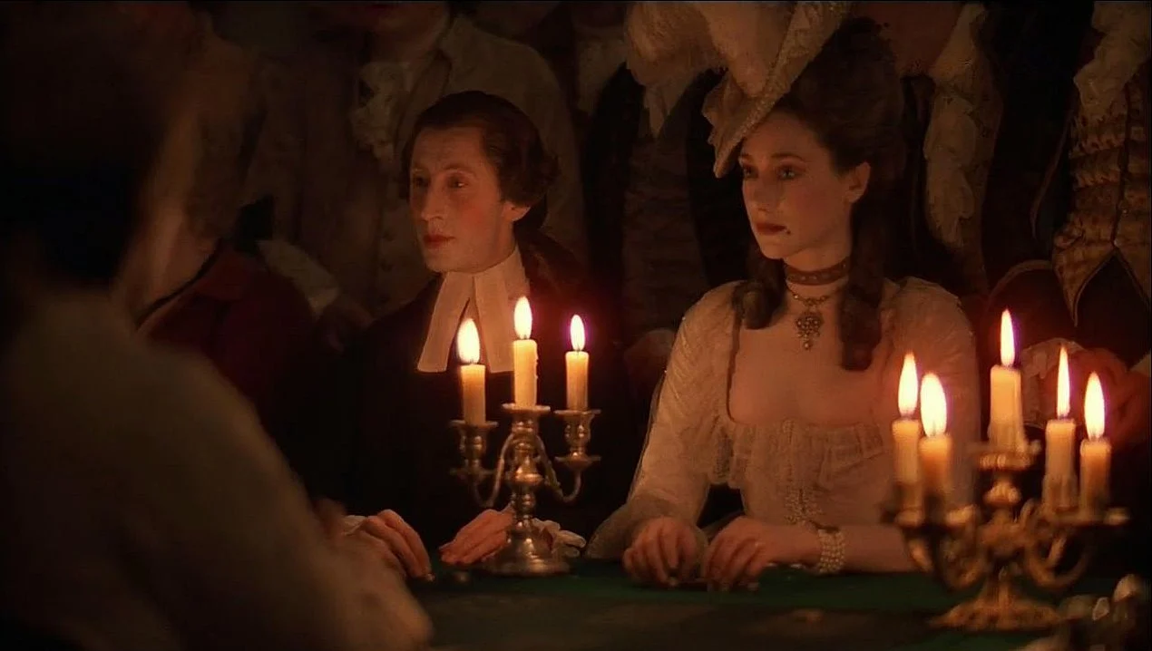
The maximum aperture refers to how wide the aperture can open, and that affects how much light it lets in. A lens with a maximum aperture of, say, 1.2 lets in more light than one with 1.8—and usually costs quite a bit more. In Barry Lyndon, Stanley Kubrick famously used a lens developed by NASA with a 0.7 aperture. That allowed him to shoot scenes lit only by candles. At the time, film wasn’t nearly as light-sensitive as today’s digital cameras, so that was a major achievement.
There are plenty more lens features out there, but these are the big ones you’ll want to keep in mind when selecting the right lens for your film. And here’s the funny part—the "perfect" lens for your story might not be the newest or most expensive. The right lens is always the one that just serves your story best.
So, keep watching movies with an eye for images that really speak to your project. When something stands out, look into how it was done. Maybe it was made with specialized lenses, old ones, or even lenses that had been modified.
If you're lucky, you might even get to use them. Panavision, for example, is known for keeping modified lenses from major films and making them available for other productions. And don’t overlook your local rental house either. Ask them what lenses rarely get checked out—you might find hidden gems there. Maybe they’re not the sharpest or cleanest, but they could be the perfect fit for your story.
If you're enjoying this journey, make sure to subscribe, leave a review, and join me next time as we keep exploring how filmmakers bring images—and stories—to life.
If you have any thought, an example that wasn’t mentioned or a question, feel free to reach out—just email [email protected] . You can also check out my book at TheLanguageofCinematography.com.
Thanks for spending time with me today. Goodbye!