
The Cinematic Composition
This is a transcript from Visium: The Secret Language of Images. Listen to the episode below:
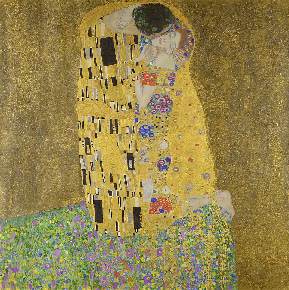
Back in the early 1900s, the University of Vienna hired the famous artist Gustav Klimt to paint the ceiling of their Great Hall. You might recognize Klimt from one of his most iconic works, The Kiss. For the university, he painted three large pieces. But when he presented them, the reaction wasn’t what he expected. The faculty was outraged. Klimt was known for pushing boundaries and challenging social norms—but this time, critics felt he had gone too far. Some accused the works of being obscene, even pornographic. In the end, the university removed the paintings, and Klimt walked away from public commissions for good.
Filmmakers tend to forget that the origins of cinematography and photography is in the visual arts, from painting to sculpture. And as film developed, it didn’t just shape culture—it was shaped by it. Artistic movements after the birth of film often influenced how movies looked. German Expressionism, for example, created a visual language that later helped define the style of film noir.
Composition is the intentional arrangement of elements within the frame. Everything counts—props, actors, locations, and lighting. What’s closest to the camera? What’s emphasized? The placement, size, and relationship of everything in the frame shapes how the audience sees the scene and how they feel about it.
Klimt’s experience with the University of Vienna highlights a tension that still exists today—what happens when art meets a commercial or public space. In episode 2, we talked about how film is a form of communication, not just personal expression. Sure, we all like to think of our work as an open canvas for creativity, a pure form of expression. But once your work enters a commercial space (whether it’s a gallery, a movie theater, or a streaming platform) it also carries a responsibility. You’re now working with a wider audience, and that means being aware of clarity, tone, and the expectations of the world around you.
Klimt found that out the hard way.
I’m Tal Lazar, and this is Visium—where we explore images and figure out what makes them work. In this first series, we’re focusing on the images you see in movies.
Our topic today is composition. When you hear that word, what comes to mind? For many people, it’s probably a painting—something with carefully chosen colors and framing. And that’s not wrong. But when we talk about composition in film, we have to go a little deeper.
At the heart of any good composition is intention. We usually assume there's an artist behind the image who made certain choices to create a specific effect. But that’s not always the full story.
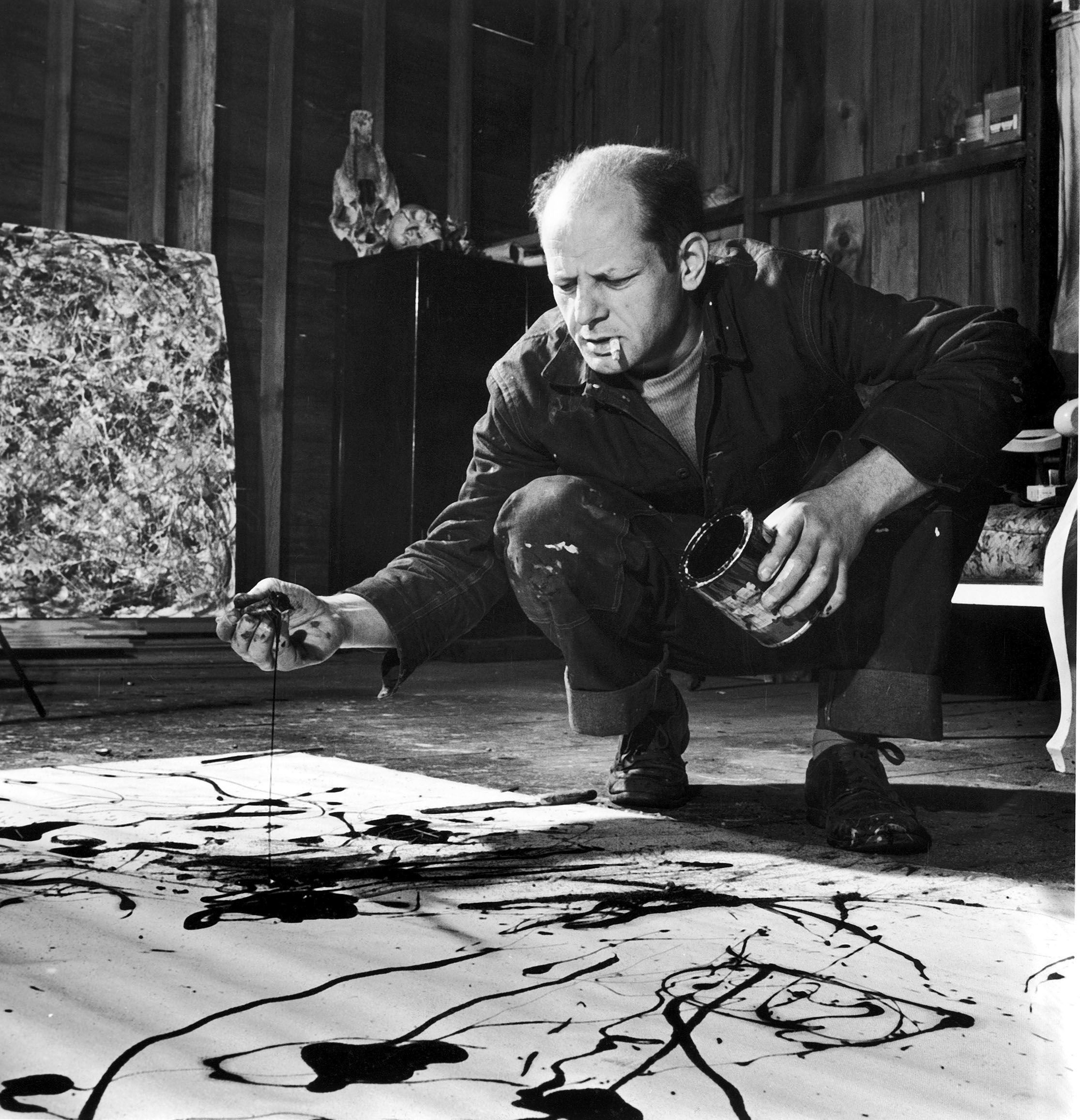
Take Jackson Pollock, for example. He’s known for his large, abstract drip paintings. He didn’t set out with a clear plan—he came across his technique by accident, when some paint spilled on his canvas and he decided to try working with it. His process was more about discovery than design.
Or there's J.M.W. Turner, the painter famous for his hazy landscapes. He stumbled onto that atmospheric look when one of his paintings was left to dry in damp weather. The dampness changed the way the paint settled—and he liked what he saw.

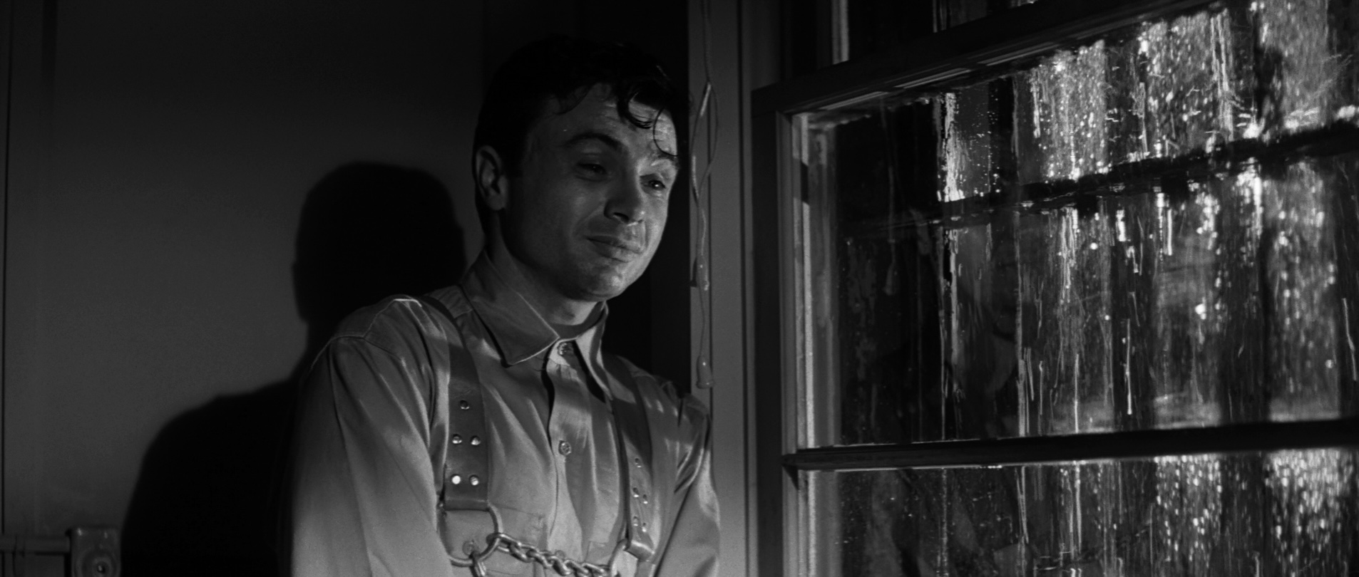
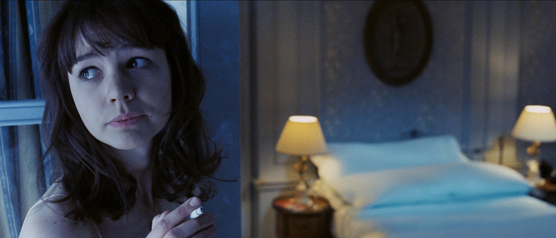
This kind of thing happens in movies, too. One of the most famous examples comes from In Cold Blood. Cinematographer Conrad Hall noticed that the fake rain outside a window was casting shadows onto the actor’s face. It looked like tears. Hall recognized the emotional power of that effect and decided to keep it. That moment didn’t just enhance the scene—it made it unforgettable.
So if these powerful visual choices weren’t really choices at all, can we still say they’re examples of intentional composition? If some of the most effective choices weren’t planned, does it change how we value them?
Let’s look at it from another angle. Imagine you're sitting in a theater, watching that scene from In Cold Blood. Perry Smith, a convicted murderer, is quietly talking with a chaplain before his execution. He's describing his father in a calm, steady tone. But those shadows, those rain-drop shaped tear shadows, make it feel like he's crying. It's subtle and haunting.
Now, as a viewer, in that moment, do you care if the effect was planned in pre-production or discovered by accident on set? Probably not. What matters is that it works. That it hits you in a way you’ll remember. And that’s the real test of composition—not if it was designed or discovered, but if it leaves a mark.
Our approach on this podcast follows the idea introduced back in episode one—the quote from Irving Penn. We look at visual choices from the audience’s perspective. For that to work, we assume intent. In other words, the audience views every element in an image as purposeful, even if it happened by accident—or even if the filmmaker didn’t notice it at all.
A good example of this has to do with the relationship between the foreground and background in a shot. Say I’m standing in a room, deep in thought, and someone is doing something way behind me, maybe 20 feet away. In real life, you wouldn’t automatically find meaning in that setup. But in a film, the audience usually assumes a connection between what’s close and far. Even if the story doesn’t spell it out, they’ll look for it—they’ll imagine it if they have to.
There are two takeaways here. First, always take a careful look through the frame before you hit the red button. On set, small monitors can hide things you don’t want in the frame—like cables, gear, or a forgotten coffee cup. More importantly, they can also hide opportunities. So whenever you can, step away from the monitor and use your eyes; their resolution is better than any screen.
The second lesson? Take credit for the good stuff, even if you didn’t plan it. Because whether or not something was intentional, the audience experiences it as part of the composition. And just like you’ll have to take responsibility for mistakes, you can own those accidental wins too.
So let’s talk about composition. At its core, composition is the intentional arrangement of elements within the frame. We’ve already covered the idea of intention. Now let's look at what kinds of elements we're arranging. Everything counts—props, actors, locations, and lighting. What’s closest to the camera? What’s off-screen but still implied? What’s emphasized? What’s hidden? The placement, size, and relationship of everything in the frame shapes how the audience sees the scene and how they feel about it. That’s what composition is all about.
And of course, it all happens in a two-dimensional image, that’s the frame. A movie screen is flat, so any sense of depth is something we create. That means we can take a massive space and make it feel small (or turn a tight room into something that feels roomy and deep) just by using visual tools like lens choice, lighting, and camera placement. We’ve covered these in earlier episodes, and they all play a role here too.
The image is also limited by the shape of the frame. There's the cinematic widescreen of 2.40, standard TV at 1.78, the older 4:3 format, or even vertical formats used in social media—taller than they are wide. Each frame shape has its own strengths and limitations. A close-up in one aspect ratio won’t feel the same in another. That’s why understanding the frame and the tools you use to fill it is so important—it directly affects how the audience connects with your image.
The intentional arrangement of elements within an image. That’s composition. But it’s more than just placing props or positioning actors. What we’re really working with are design elements. If you’ve studied any visual art, these might sound familiar: line, shape, form, brightness and darkness, color, texture, and movement. They show up in paintings, and they’re just as present in photography and cinematography.
These elements aren’t as easily recognizable like an actor or a car in the frame. They're more subtle, but they’re powerful. They can direct attention, hide things, and influence how a moment feels. Before we jump into each of these design elements, though, it helps to understand how they function in a composition. A common misunderstanding is that if we’re talking about color, for instance, it just means painting something red or green. But it’s not about the object alone—it’s about how that object relates to what’s around it. Composition is built on relationships.
At the core of that is the principle of contrast and similarity. Let’s go back to that red object example. A red object in a red environment blends in, it shares similar qualities with everything else. Put that same red object in a green environment, though, and it pops. Red and green are complementary colors, so the contrast makes the object stand out more. The red never changed, but the way we see it did, just because of what’s around it.
Contrast and similarity come in many forms. We often think of contrast as black versus white—light versus dark. But it appears in lots of other ways, too. There’s contrast of movement: a still background with one object moving immediately draws your eye. Contrast of size can suggest power—like a massive figure next to a smaller one. Or contrast in emotion: imagine someone with a shocked expression sitting in a movie theater full of people laughing.
So as we start to explore design elements like line, shape, and color, we’ll focus on how they play off each other. Because in the end, that’s how a composition takes shape—through the relationship between what we put in the frame, and the way we choose to show it. So let’s start with line.
When we look at images, we naturally bring our understanding of the physical world into them. Up feels like “up,” and down feels like “ground.” Things can feel stable, or shaky, high or low, warm or cool. And once you start noticing it, you realize you can find contrast in just about anything. But this idea is especially powerful when it comes to lines in an image.
Picture a white frame filled with lots of small vertical lines, like fast-moving raindrops. Without any other context, you still feel movement—from top to bottom. That’s because, even in a flat image, gravity still seems to apply.

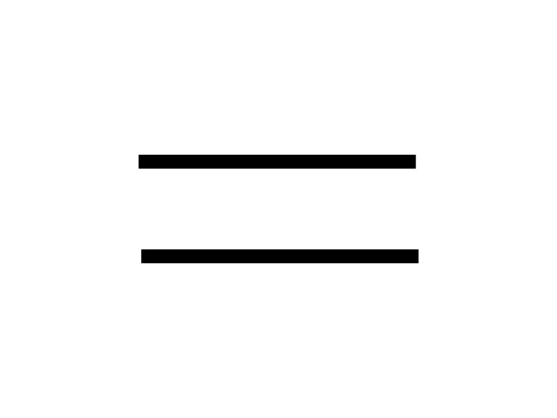
Now imagine two evenly spaced horizontal lines, centered in a white frame. It feels stable, quiet, almost frozen. So you might think, “Okay, this is great when we’re talking about abstract images—but what does it have to do with movies? I film people, places, and things.”
Here’s where it gets interesting: we perceive images on two levels at the same time. On one level, we recognize the people, spaces, and objects in the frame. But on another level, we’re picking up on shapes, lines, and movement—just like looking at an abstract painting.
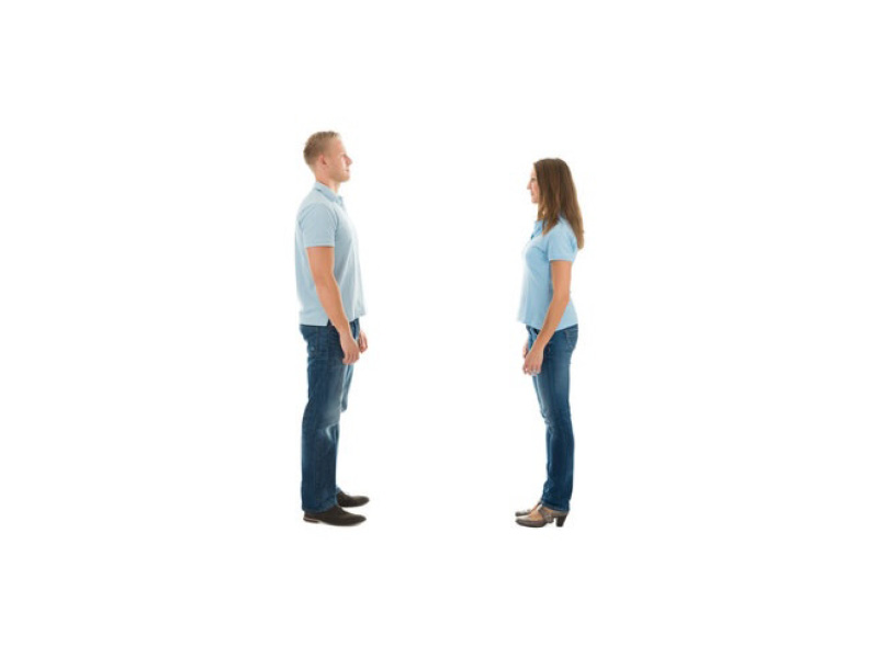
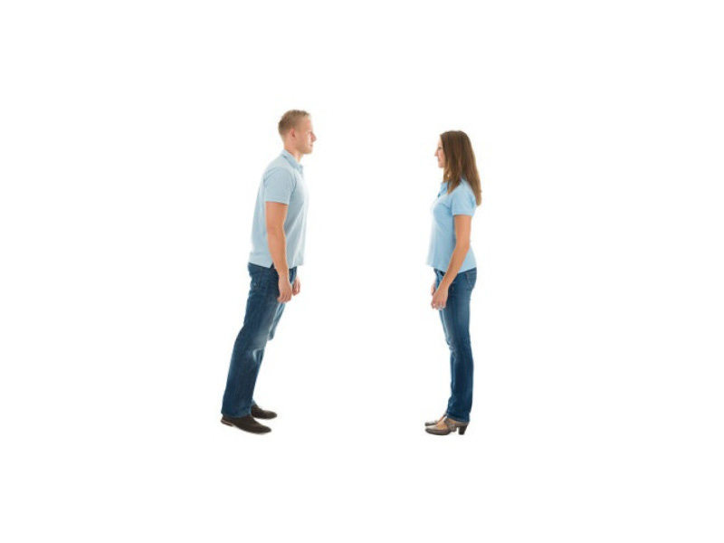
Imagine two people standing in a white frame, facing each other. It feels still. Now tilt one of them slightly, like they’re mid-fall. Suddenly the image feels very different. That sense of movement comes from the basic shape of the line, because of how we associate diagonal lines with instability and gravity.
Lines can appear inside familiar forms (like a row of trees or the edge of a building) or they can be the forms themselves. Lines guide the eye and set the structure of your image. Traditionally, vertical and horizontal lines suggest stability. Diagonals bring energy or tension. But you can also create drama through contrast in lines. For example, a single vertical line in a composition of mostly horizontal lines will immediately stand out.
Now swap those abstract lines for real-world ones—cars, people, telephone poles, windows, shadows. That's when things really start to click. Just remember to keep it simple. When I think of using design elements in a composition I use, what I call the 3-second rule. Any design element (like a line) I use should be noticeable within three seconds of someone looking at the image. If not, I’m probably overthinking it. We’re talking about big choices here, like the horizon line or a lone figure in an open field. A faint diagonal line way in the background? That doesn’t count.
Another thing to keep in mind is that lines don’t have to be visible—they can be implied. Think about four dots that form the corners of a square. Even without the lines drawn in, our mind fills them in. The same happens in realistic images. If two characters look at each other in a shot, our brains draw an invisible line between them. If one person points toward something off-screen, it creates another invisible line that leads the eye.
There’s so much to explore when it comes to line. And funny enough, abstract paintings are a great way to study this—especially if you work in film. In abstract art, you can see design elements like line in their purest form. It helps you focus on the emotional and visual impact without getting distracted by the subject matter. Once you understand what those lines are doing in a painting, you can recreate the same effect in your film shots—this time, using people, places, and story.
Our next stop is to look at some other design elements and see how they apply to movies. If you're enjoying this journey, make sure to subscribe, leave a review, and join me next time as we keep exploring how filmmakers bring images—and stories—to life.
If you have any thought, an example that wasn’t mentioned or a question, feel free to reach out—just email [email protected] . You can also check out my book at TheLanguageofCinematography.com.
Thanks for spending time with me today. Goodbye!