Design Elements
This is a transcript from Visium: The Secret Language of Images. Listen to the episode below:
On April 25th, 1874, art critic Louis Leroy wrote a scathing review of a new exhibition by a group of painters who called themselves the Impressionists. He called their artwork “unfinished” and even said that looking at wallpaper was more enjoyable than looking at their paintings.
The exhibition included work by artists like Claude Monet and Edgar Degas. One piece that got a lot of attention was Degas' painting The Rehearsal of the Ballet Onstage, which you can find today at the Met Museum in New York City. At the time, people expected paintings to follow traditional rules: smooth brushwork, scenes from mythology or the Bible, and neatly balanced compositions. Degas did something different. He focused on modern life and framed his scenes in unusual ways. Some had too much space above or below, others cut off heads, or showed people turned away.
As filmmakers, we have to watch out for falling into habits or blindly following rules, because that won’t take us anywhere new. But at the same time, we need to understand those tools and traditions. That’s how we can choose which ones to use, and maybe even break them in smart ways.
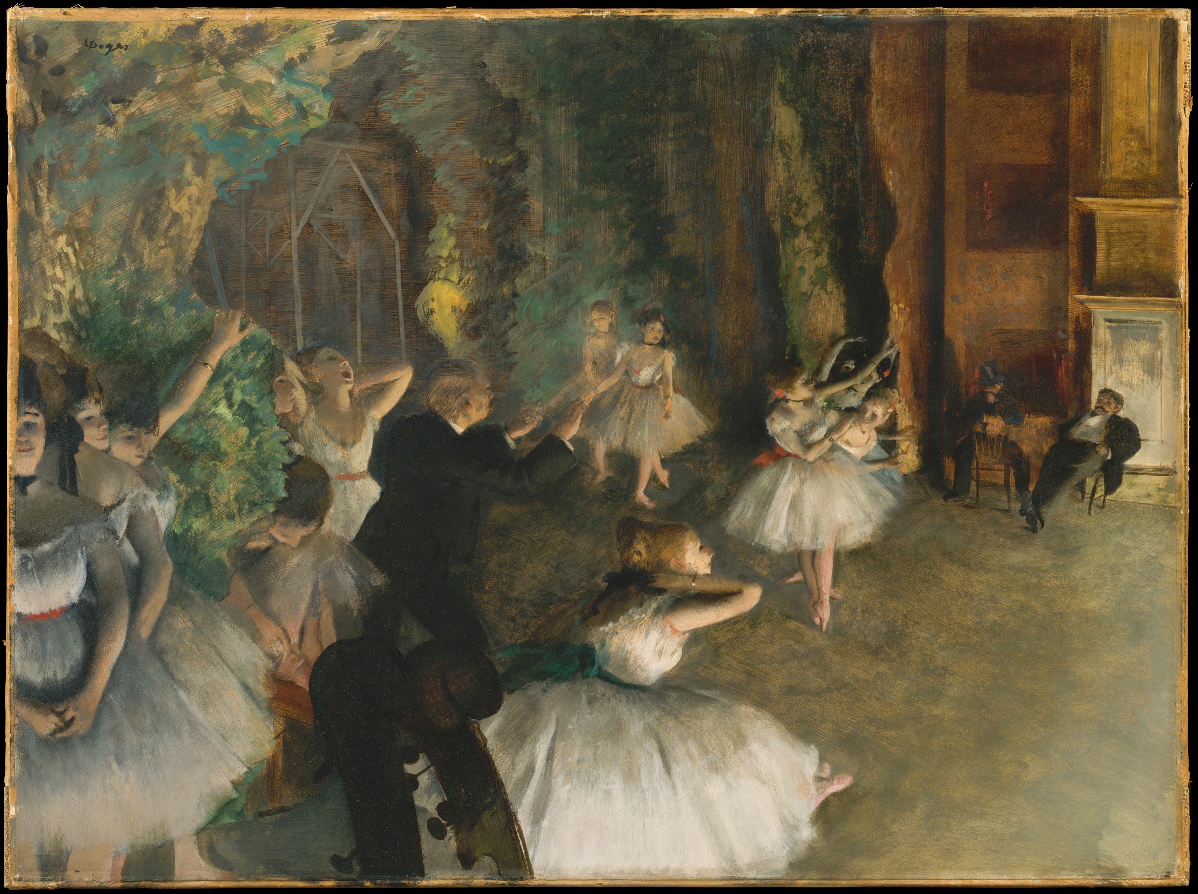
But if you visit the Met, go up to the second floor and find gallery 816, that’s where Dega’s The Rehearsal of the Ballet Onstage lives, you’ll notice something the critics at the time missed. The painting feels like a snapshot, like it caught a quick moment. That’s not an accident. Degas was very interested in photography and learned from early photographs. His paintings mix classic technique with the candid feel of photography.
Everything critics thought was a mistake or some kind of carelessness actually came from careful planning. Degas once said, “No art was ever less spontaneous than mine. What I do is the result of reflection and the study of the great masters.”
There’s a good lesson in that. As filmmakers, we have to watch out for falling into habits or blindly following rules, because that won’t take us anywhere new. But at the same time, we need to understand those tools and traditions. That’s how we can choose which ones to use, and maybe even break them in smart ways, just like Degas did when he brought together painting and photography to say something new.
I’m Tal Lazar, and this is Visium—the show where we dive into images and figure out why they work. In this first series, we’re looking closely at the images you see in movies.
Last episode, we talked about composition and took a closer look at the first design element: line. This time, we’re diving into a few more: shape, brightness and darkness, and texture. These elements are powerful tools, and understanding how they work can help you gain even more control over the images you create today. You might have noticed I didn’t mention two big design elements: color and movement. Don’t worry, we’ll dig into those in the next episodes.
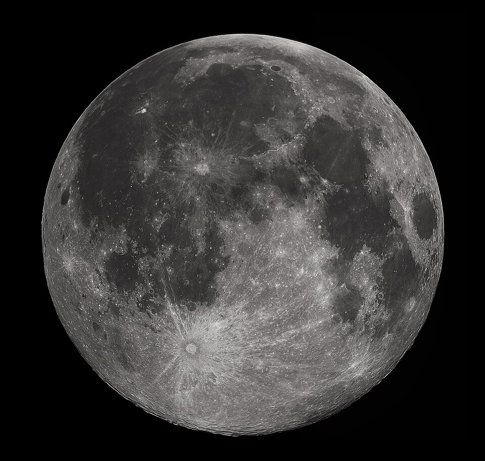
Let’s start with shape. In a composition, shapes usually come in the form of circles, squares, and triangles. But, like lines, we usually don’t notice them as geometric shapes. Think about an image with the moon in it. When you see it, do you think “circle” or “moon”? Most likely, you’ll just call it the moon. Still, just like lines, these shapes guide our attention and influence how we feel about an image even if we’re not fully aware of it.
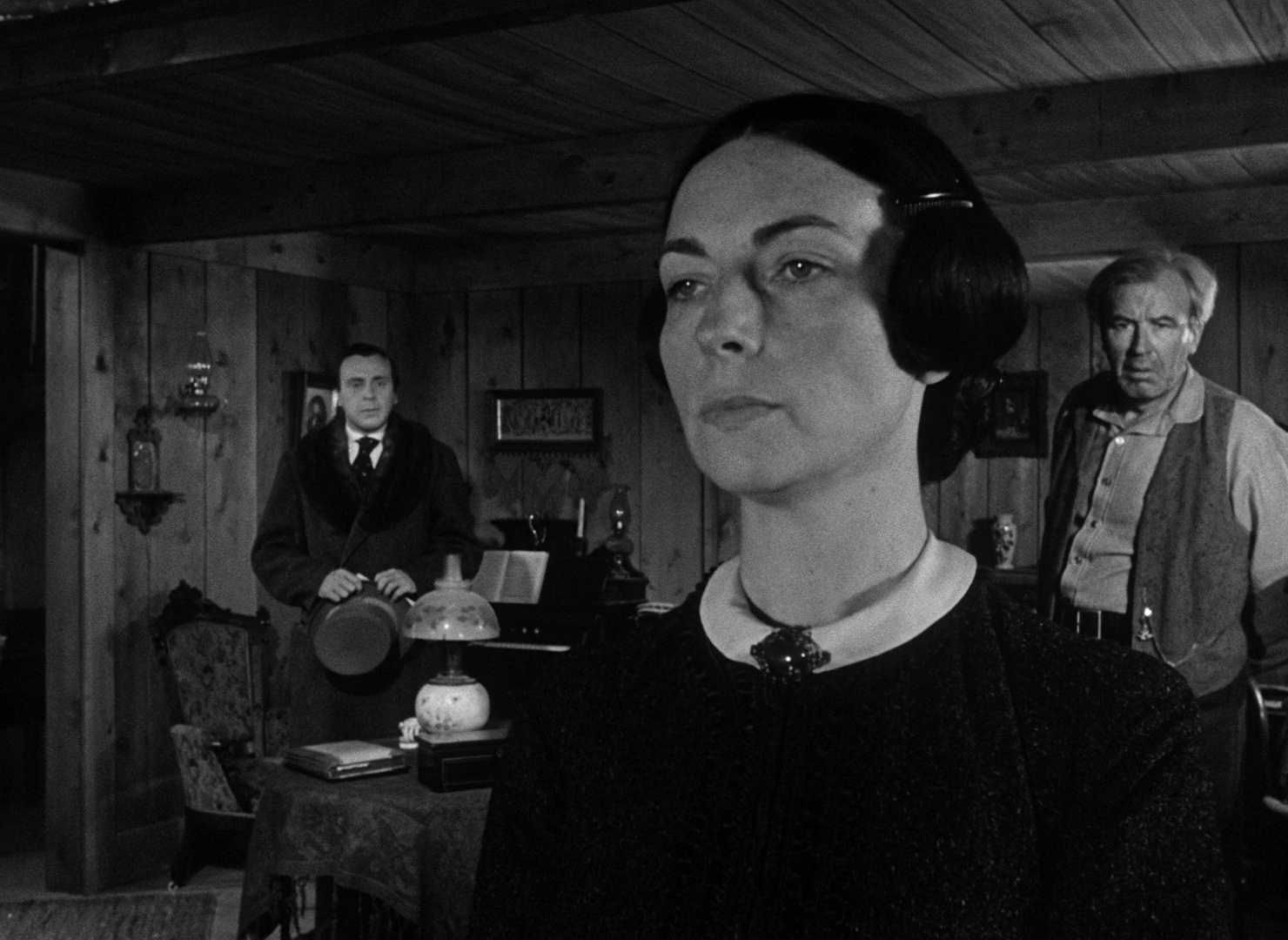
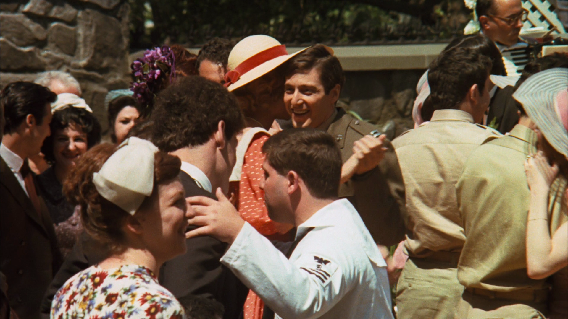
Shapes help form the structure of a composition. A triangle, for example, can suggest a power dynamic by placing someone in power at the top. A great example of this is in the opening scene of Citizen Kane. Kane’s mother is framed larger and higher than the two men beside her, which implies that she has the authority to decide her son’s future.
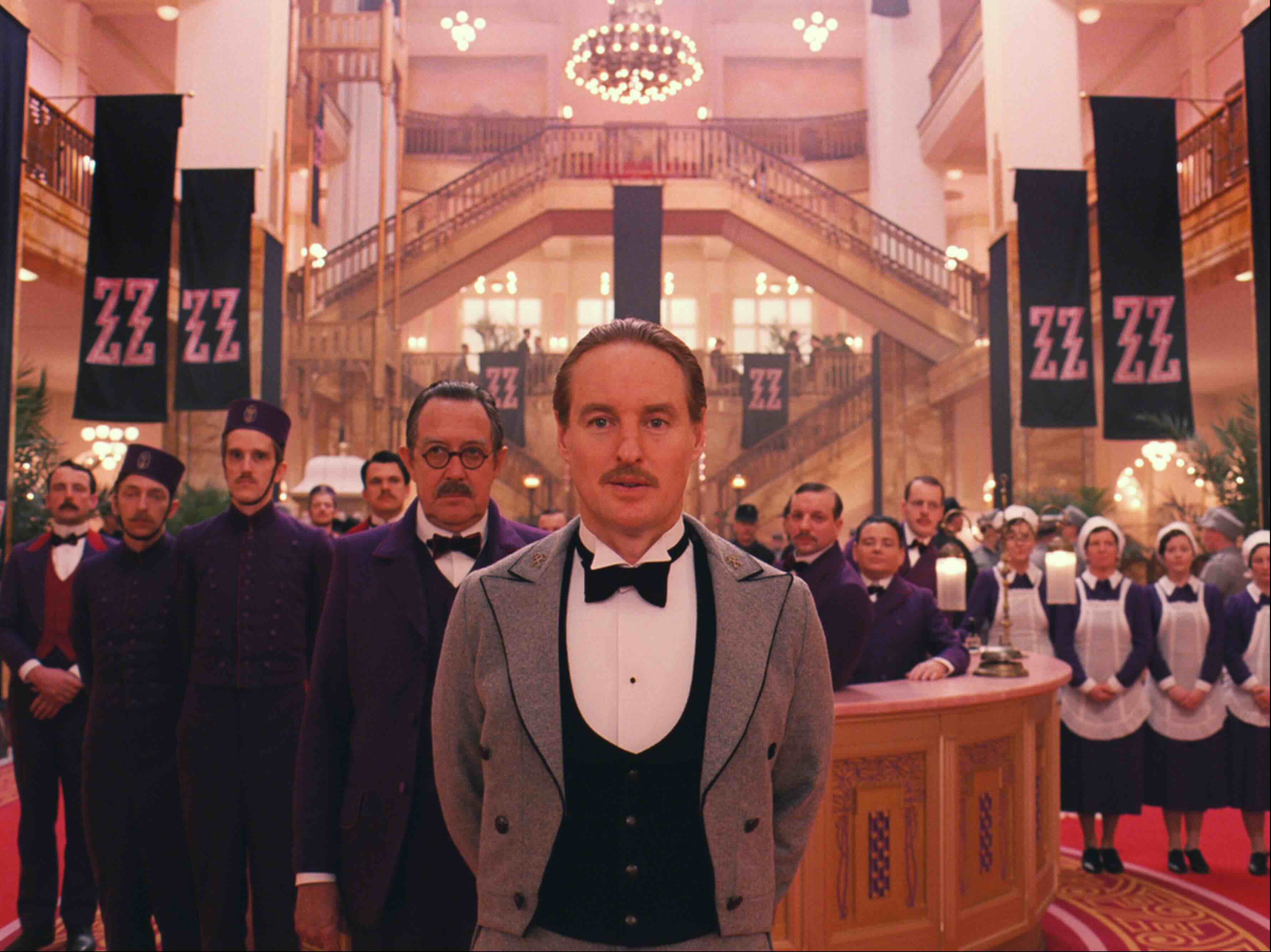
Squares tend to feel stable and balanced. Director Wes Anderson uses them all the time to create his famous symmetrical shots. He even uses a square aspect ratio (narrower than the usual widescreen format) to reinforce that feeling of structure and symmetry.
There are plenty of examples of shapes in composition, the trick is learning to spot them. Try to look past the familiar objects and people in the frame, just like we did with lines. When you do, you might notice something larger guiding the way the frame feels, and that’s where shapes come in.
To see these shapes clearly, it helps to remember that a composition is really just a flat, two-dimensional space. Any sense of depth we get from it is an illusion. But here’s the good news: we can control that illusion too, using another design element: space.
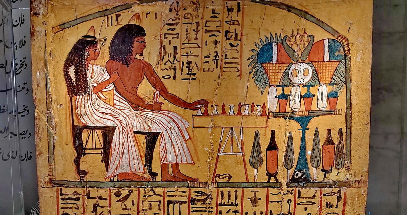
Space in a composition is closely tied to how we understand and connect with the imaginary worlds we see on screen. Think back to how kids learn to draw. In the beginning, everything is flat, just stick figures and basic shapes. Later they start to add depth, and make things look more three-dimensional. The same thing happened in art history. One of the earliest examples of trying to create depth in images comes from ancient Egypt. In Egyptian tomb paintings, artists used a technique called overlapping (placing one object partially in front of another) to give the illusion of depth. That’s known as a depth cue.
There are some other depth cues. Size is a big one: larger objects in a frame usually feel closer to us. Texture helps too. We see more detail in things that are close, and distant objects look smoother or blurrier. And color plays a role too. If you’ve ever looked out from a very high vantage point, you might’ve noticed that the horizon tends to look a little bluer. That’s because of aerial diffusion, and artists have used it for centuries to suggest distance.
So if we go back to the opening scene of Citizen Kane, Kane’s mother appears large and close in the frame, not just to show her power but also to emphasize the the space around her. Even though the room itself is small and the characters cross it in just a few steps, it feels expansive because of how the scene is shot.
Filmmakers can choose to use these depth cues to create a strong sense of space, or flatten it completely. That decision can have a big effect on the mood or meaning of a scene. So here’s something to think about: how would you use depth in your own work? When would deep space feel right, and when would flat space tell the story better?
These kinds of choices are part of the creative conversation between a cinematographer and a director. And they can influence everything from which lens to use to where to the choice of a location.
Brightness and darkness, also known as value, are the next design element to explore. We’ve touched on this before when we talked about contrast, and that’s because brightness and darkness really only work in relationship to each other. Without contrast, they lose most of their power.
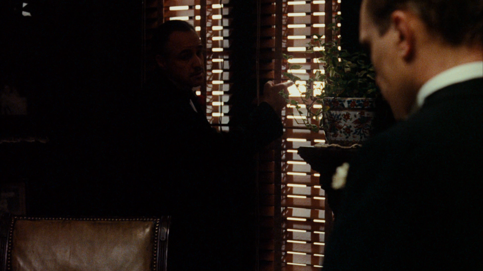
Take The Godfather, for example. There's a scene where Don Corleone watches a wedding party through the window of his office. Inside, the office is dim, almost shadowy. Outside, the wedding is bright and full of life. It’s this contrast between the two settings that tells us something deeper: one world is full of happiness, the other is heavy and somber. But for the contrast to hit, the darkness has to feel really dark—you can barely see the actor’s eyes. And the bright scene needs to be, well, very bright, and in the film its lit by direct sunlight.
There are plenty of scenes in film where brightness and darkness carry the story. We just need to remember that the human eye adjusts quickly. Watch a dark movie for long enough, and that darkness starts to feel normal. That’s why contrast is so important. It reminds the audience what’s bright and what’s dark, so they continue to feel the effect of these choices.
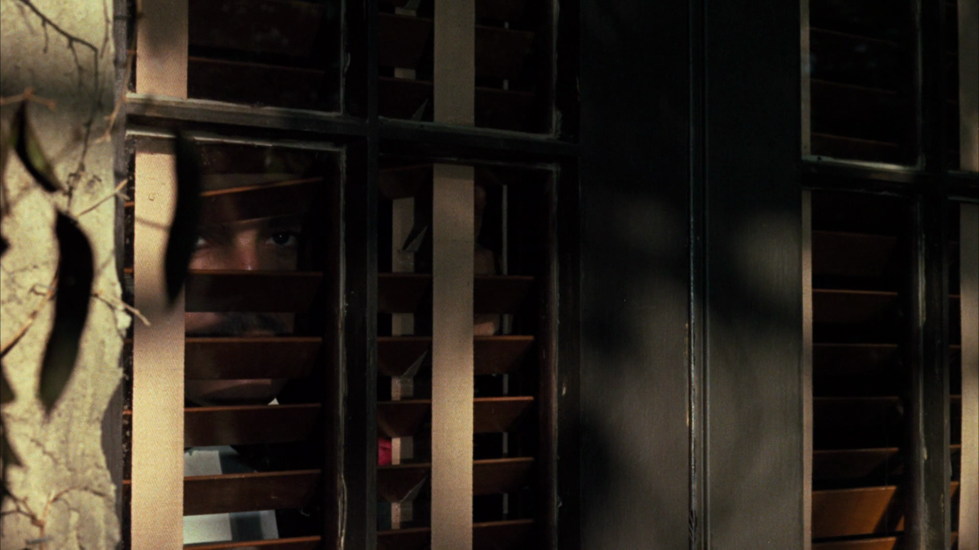
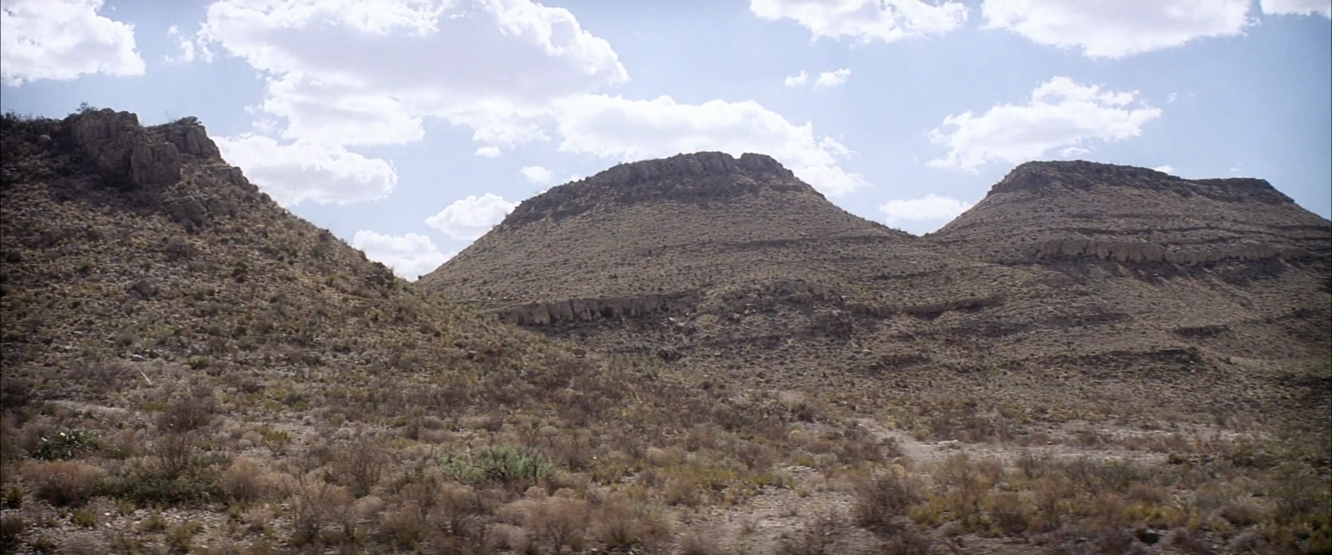
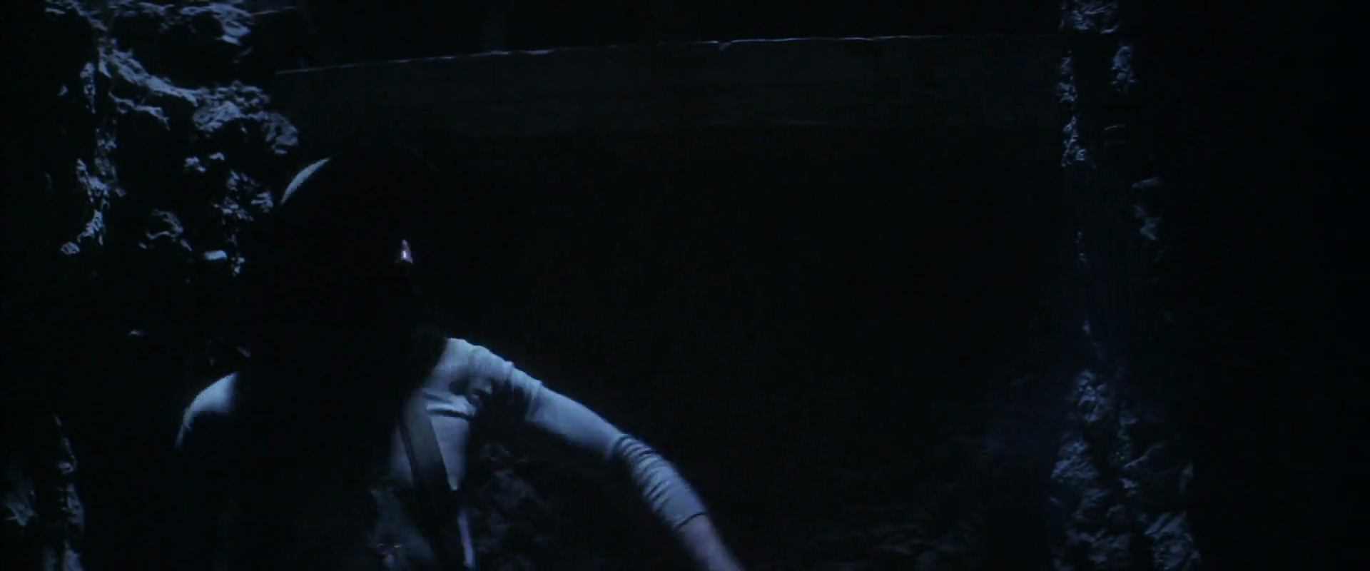
Here’s another great example. In the opening of There Will Be Blood, we start in a wide desert, brightly lit by the sin, for just a few moments. Then we cut into a dark underground tunnel where we meet the main character. That bright moment at the beginning actually makes the next scene feel darker than it really is. The filmmakers use contrast to sell the feeling of darkness, without making it so dark we can’t see what’s happening. Smart, right? Turns out that to make something look dark, you don’t need to make it too dark, you can use the audience’s eyes to create that effect.
Texture is our final design element for now, and it’s a subtle one. It works by triggering our sense of touch. When we see texture, we imagine what it would feel like to run our hand over it. That’s why texture can draw us into a story, making us feel more present in the scene. Or, it can do the opposite: create distance and make a world feel more abstract or stylized.
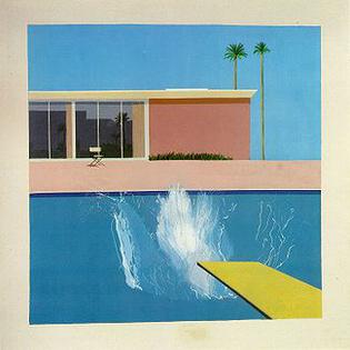
Take David Hockney’s The Splash, a very famous painting. It shows a pool, a house, some plants, and a mountain view. But none of it has real texture. Everything is painted in flat, graphic shapes. That choice makes the scene feel removed from reality, like we’re not supposed to be pulled in emotionally, but instead pay attention to how it’s constructed or what it represents.
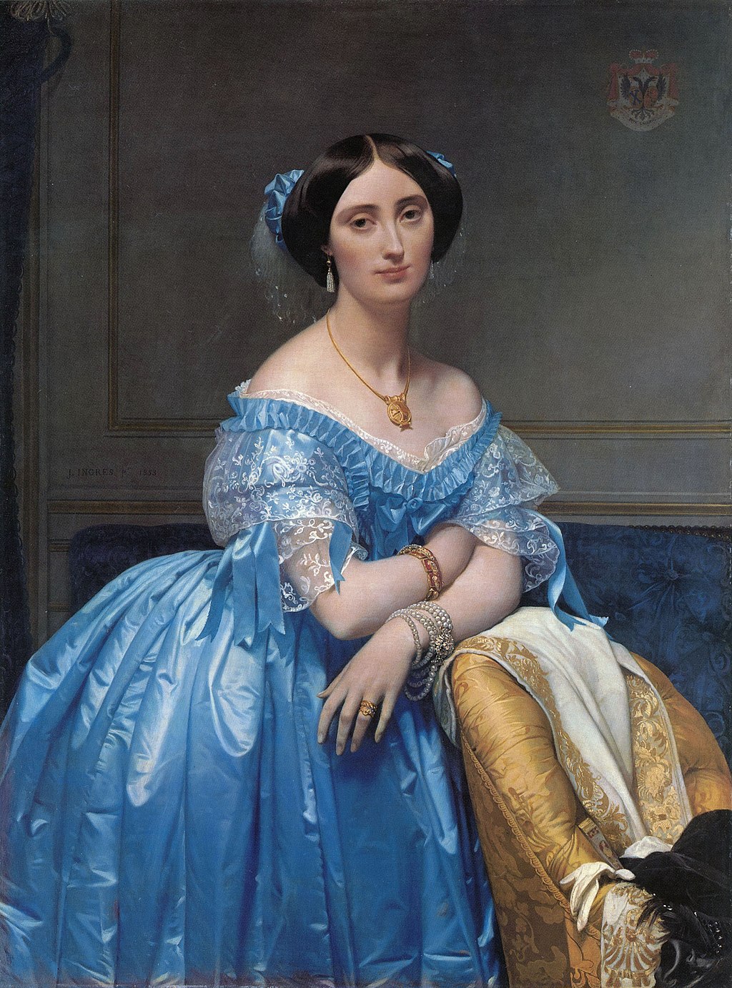
Now compare that to a hyper-realistic painting, like The Princess de Broglie by Jean-Auguste-Dominique Ingres. This painting is all about texture. The princess’s dress is painted with such detail that you can almost feel the smoothness of the silk. The painting becomes more than just an image, it feels like a moment frozen in time, and we become part of it, as if we’re in the room with her.
As filmmakers, we can control texture in two ways. First, by choosing textured objects, like cracked walls, aged wood, wrinkled clothing, or crumpled paper. Second, through lighting. Hard side lighting brings out texture because it creates tiny shadows that make surfaces look more detailed. On the other hand, flat lighting (that’s soft light coming from the same direction as the camera) tends to soften or hide texture.
So here’s something to think about: how would you use texture to tell your story? That question brings us back to the ongoing collaboration between the director and cinematographer. And that often starts by looking at images, figuring out what works, and asking why.
Our next stop is to look at color, such a big topic that it deserves an episode of its own. If you're enjoying this journey, make sure to subscribe, leave a review, and join me next time as we keep exploring how filmmakers bring images, and stories, to life.
If you have any thought, an example that wasn’t mentioned or a question, feel free to reach out—just email [email protected] . You can also check out my book at TheLanguageofCinematography.com.
Thanks for spending time with me today. Goodbye!